SharePoint Branding Build Test Checklist
During the creation of the CSS, Master Pages, and Page layouts its critical to stay on top of your Front End Development testing.
As you know many classes in SharePoint are shared classes so when you make a modification to one element you have to test, test, test.
Below are some helpful things to review before giving that oh so critical demo… Hopefully these will help you out during your development process and testing.
As you know many classes in SharePoint are shared classes so when you make a modification to one element you have to test, test, test.
Below are some helpful things to review before giving that oh so critical demo… Hopefully these will help you out during your development process and testing.
- Create and test all OOTB SharePoint templates
- Publishing Sites
- Publishing Toolbar
- Page Layouts (All that are available)
- My Sites
- My Profile
- Organization Hierarchy web part
- In Common with you web part
- My Profile
- Team Sites
- Meeting Workspaces
- Tabs
- Recurring Meeting Workspaces Quick Launch
- Blog
- Unique Quick Launch
- Post date, title, content, and links
- Wiki
- Functional Links (Edit, History, Incoming Links)
- Unique Quick Launch (Recent Changes)
- Last Modified
- Search
- People search drop down options
- Search Results
- Advanced Search Link
- Advanced Search Page
- Central Administration
- Don’t spend to much time on these
- Publishing Sites
- Test as many SharePoint functions as you can
- Fly Out Menu’s/Drop Downs
- My Links
- Top Navigation
- Site Actions
- Modify Web Part
- Quick Launch if enabled
- Multi Tier/level if enabled
- Document Item Drop Down
- Button Hovers
- Search/Go
- Global Links (Top Links like My Links)
- SPLink (Welcome & Console Toolbar Buttons)
- Toolbar View Button
- Quick Launch
- Headers
- List Items
- Selected headers/Items
- Tree View
- Breadcrumbs
- Text
- Hyperlinks
- Carrots “>”
- Toolbars
- Calendar
- Date Picker
- Month View
- Week View
- Day View
- Current Day Indicators
- Lists/Libraries
- Datasheet View
- Alternating item shade (ms-alternating)
- Webpart
- Chrome/Title
- Border color/width if selected (ms-WPBorder)
- Separator Lines
- Edit Page
- Webpart Zone Colors
- Drag and Drop Style
- Webpart Chrome/Title’s
- Advanced Webpart Gallery and Options
- Admin Pages
- Site Settings
- List Forms
- Form Background (ms-authoringcontrols)
- Upload Document
- Error Pages
- OOTB Themes
- If you are going to allow OOTB themes you will have to test, test, and triple test that all themes work and function as expected with your custom design…
- Fonts/Colors
- Stick to system Fonts so that everyone gets the same experience. (Verdana, Tahoma, Arial, Etc)
- Page Titles
- Body Content
- Hyperlinks
- Hover Text
- Visited State
- Images
- Teamsite Default Image
- Social Meeting Workspace Image
- Customization/3rd Party
- Its kinda a given but any custom web parts, 3rd Party or custom controls implemented will need to have branding applied or tested before deployment onto prod servers.
- Fly Out Menu’s/Drop Downs
Wednesday, October 1, 2008
Branding SharePoint Drop Downs
SharePoint has quite a few different drop down menus, within this post I will highlight the three primary drop downs and the CSS that drives it.
#1 Main Navigation Drop down:
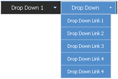
The Main Navigation drop downs are a new addition to SharePoint from its previous SPS 2003 version. Here are the following classes that make up this navigation:
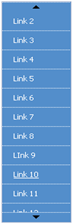 The SharePoint team also put into place a little hidden gem of logic that states that when a list is longer than the height of the page, it will create a scroll type drop down.
If you move your mouse to the top arrow it will scroll up, and if you move your mouse to the bottom as expected it will scroll down.
If you look at the image below the screen capture has 4 main navigation items all with drop down items. The ID's highlighted in green specify the Top Navigation Menu Item # 1, 2, 3, 4. For each navigation menu item if a drop down is available SharePoint will add in two div tags. The first one is the Menu Items Up which has an Image drawn from the /WebResource.axd file. The second DIV tag right below it is the Menu Items Down which also has an Image drawn from the /WebResource.axd file.
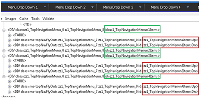
If you really needed to customize this you could simply add the following classes to your alternate stylesheet. But you would have to make sure you create as many Menun #s per how many top navigation items you have on your site.
#2 Site Actions Drop Down:
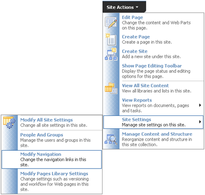
The Site actions drop down is a bit more complex. It uses quite a bit more styles than the main navigation. Here are some things to consider when branding this menu:
#3a Document Drop Down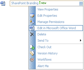
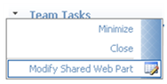
#3b Modify Webpart Drop Down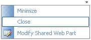
Both of the examples above use the same menu classes. You will notice that the space dedicated to the icons is allot smaller. All the classes for the large drop down are shared but for this menu it uses the following class to specify its smaller background image.
One last thing to consider is if you are deploying language packs that change the orientation of text to read right to left. The navigation will also be change.
Here are the classes that make up the right to left menus:
Drop me a comment if you have any questions/comments
#1 Main Navigation Drop down:

The Main Navigation drop downs are a new addition to SharePoint from its previous SPS 2003 version. Here are the following classes that make up this navigation:
Class Name | Details |
| .ms-topNavFlyOutsContainer { border:solid 1px #c2dcff; } | This is the outer container. Modify this for the outer border. |
| .ms-topNavFlyOuts{ background-color:#F2F8FF; font-family:Tahoma; font-size:8pt; } | This is the inner container. Modify this for the drop down background and basic fonts. |
| .ms-topNavFlyOuts a{ display:block; *width:120px; min-width:120px; color:#3764a0; padding:4px 8px 4px 8px; } | This class specifies the drop down items, width, color, and padding. You might want to put in a width: 100% !important; tag in case you have an instance where you have a small drop down item and an item that its characters exceed 120px. |
| .ms-topNavFlyOutsHover{ background-color:#ffe6a0; color:#000000; } | This class specifies the hover state of each drop down item. You will also want to put in width: 100%; into this class as well so that you don't get a default color background that you don't want. |
 The SharePoint team also put into place a little hidden gem of logic that states that when a list is longer than the height of the page, it will create a scroll type drop down.
 If you move your mouse to the top arrow it will scroll up, and if you move your mouse to the bottom as expected it will scroll down.
If you look at the image below the screen capture has 4 main navigation items all with drop down items. The ID's highlighted in green specify the Top Navigation Menu Item # 1, 2, 3, 4. For each navigation menu item if a drop down is available SharePoint will add in two div tags. The first one is the Menu Items Up which has an Image drawn from the /WebResource.axd file. The second DIV tag right below it is the Menu Items Down which also has an Image drawn from the /WebResource.axd file.

If you really needed to customize this you could simply add the following classes to your alternate stylesheet. But you would have to make sure you create as many Menun #s per how many top navigation items you have on your site.
Class Name | Details |
| #zz1_TopNavigationMenun1ItemsUp{ background-color: #FFF; } #zz1_TopNavigationMenun1ItemsDn{ background-color: #FFF; } | This class is for the top and bottom boxes only for the 1st navigation item with a drop down. |
| #zz1_TopNavigationMenun2ItemsUp{ background-color: #FFF; } #zz1_TopNavigationMenun2ItemsDn{ background-color: #FFF; } | Same as above but for Menun #2 |

The Site actions drop down is a bit more complex. It uses quite a bit more styles than the main navigation. Here are some things to consider when branding this menu:
- Define the color of the text, both Heading and description
- Define what kind of image treatment you want behind the icons.
- Define the hover state as a user moves the mouse over each item. (Background color, and Border line)
Class Name | Details |
| .ms-MenuUIPopupBody TABLE { color:#003399; font-size:100%; margin:0px; padding:0px; } | This class specifies the Basic menu color for the Bold Menu Label. However it could be over written see below. |
| .ms-MenuUISeparator,.ms-MenuUISeparatorRtL,.ms-MenuUISeparatorLarge,.ms-MenuUISeparatorLargeRtl { background-color:#c5c5c5; font-size:1px; height:1px; line-height:1px; } | This class specifies the color of the separator line. |
| .ms-MenuUI,.ms-MenuUILarge,.ms-MenuUIRtL,.ms-MenuUILargeRtL { background-color:#fafafa; background-repeat:repeat-y; cursor:pointer; } | These classes represent the overall background color. |
| .ms-MenuUILarge { background-image:url("/_layouts/images/MGradLarge.gif"); width:250px; } | This class is specific to all large size drop down menus. Including the Welcome, and My Links drop down. |
| .ms-MenuUILabel{ padding: 2px 0px 3px 6px; } | This class specifies the bold menu labels padding. Since the color is not specified here but driven by the Pop up table. You could overide the color by adding it in here. |
| .ms-menuitemdescription { color:#666666; } | This class specifies the color of the description text for each menu item. |
| .ms-MenuUIItemTableHover { background-color:#ffe6a0; border:1px solid #d2b47a; } | This class specifies the hover state when a user moves their mouse over each item. |

#3b Modify Webpart Drop Down

Both of the examples above use the same menu classes. You will notice that the space dedicated to the icons is allot smaller. All the classes for the large drop down are shared but for this menu it uses the following class to specify its smaller background image.
Class Name | Details |
| .ms-MenuUI { background-image:url("/_layouts/images/MGrad.gif"); } | This menu specifies the smaller graphic. |

Here are the classes that make up the right to left menus:
Class Name | Details |
| .ms-MenuUIRtL { background-image:url("/_layouts/images/MGradRtl.gif"); } | Background image for small right to left menus |
| .ms-MenuUILargeRtL { background-image:url("/_layouts/images/MGradLargeRtl.gif"); width:250px; } | Background image for large right to left menus |
Comments
Post a Comment