Hide First Tab in SharePoint 2010 Navigation
I created a blog post on this for SharePoint 2007 HERE: But SharePoint 2010 is a bit more complex. Since it uses UL’s and Li’s for it’s navigation it is a bit harder to hide just one element.

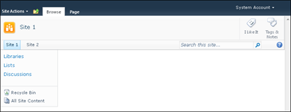
You will notice that the Home tab actually is the first node and then has a child UL which represents the rest of the navigation Items. So the approach is to hide the first <li> <a> (display: none) and then simply just use (display:block ) to show the hidden <ul> <li> <a> tags.
Here is the CSS you could use to hide just the first node (home) tab in a SharePoint 2010 application:
.s4-tn li.static > a{
display: none !important;
}
.s4-tn li.static > ul a{
display: block !important;
}
Enjoy!

You will notice that the Home tab actually is the first node and then has a child UL which represents the rest of the navigation Items. So the approach is to hide the first <li> <a> (display: none) and then simply just use (display:block ) to show the hidden <ul> <li> <a> tags.
Here is the CSS you could use to hide just the first node (home) tab in a SharePoint 2010 application:
.s4-tn li.static > a{
display: none !important;
}
.s4-tn li.static > ul a{
display: block !important;
}

Enjoy!
Wednesday, August 18, 2010
How To: Hide Left Side Navigation on Home Page
I was recently asked: "How can I hide the side nav bar on the main homepage layout ?? I want to be able to use the side NAV with in the team site etc etc, but I don't want it on the front page.. "
There are a couple of ways to do this in SharePoint 2010. If you are using a non-publishing site you can add a Content Editor Web Part to the page and add the following to the HTML Source.

<Style>
body #s4-leftpanel
{
display: none;
}
.s4-ca
{
margin-left: 0px;
}
</style>
Basically the CSS above hides the left navigation Div, and then sets the content area to not have a left margin.
Once you are done, simply modify the web part and hide it on the page.
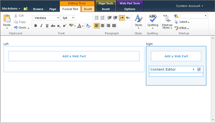
If you are using a publishing site for your homepage simply add the same styles specified above to a custom page layout. That way if you have a need for other pages that do not need the left side navigation you can re-use the page layout.
There are a couple of ways to do this in SharePoint 2010. If you are using a non-publishing site you can add a Content Editor Web Part to the page and add the following to the HTML Source.

<Style>
body #s4-leftpanel
{
display: none;
}
.s4-ca
{
margin-left: 0px;
}
</style>
Basically the CSS above hides the left navigation Div, and then sets the content area to not have a left margin.
Once you are done, simply modify the web part and hide it on the page.

If you are using a publishing site for your homepage simply add the same styles specified above to a custom page layout. That way if you have a need for other pages that do not need the left side navigation you can re-use the page layout.
Friday, August 6, 2010
SharePoint 2010 Centered Fixed Width Design
I created a blog post about 2 years ago on how to create a centered fixed width design for SharePoint 2007. Well now with a little help from a few other posts (The SharePoint Muse, Elumenotion, Styled Point) we can create a SharePoint 2010 fixed with centered design.
Now this does come with some drawbacks. By default the ribbon is intended to stay static and always be visible to the contributors on the top of the page. However due to the complexity of fixing a site’s width. The ribbon will need to scroll with the body of the page to avoid a vertical scroll in the middle of your page once it is centered…
The trick to get this to work is to do the following:


If you wanted to add some background color and borders to enhance the centered design replace it with this:
body{
overflow:auto !important;
background-color: #21374c;
}
.s4-widecontentarea{
background-color: #FFF;
}
form
{
width:980px;
margin: auto;
}
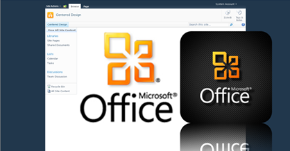
The following is how it might look:

The last draw back to fixing the width of a SharePoint 2010 site is that the content is within a floating <DIV> tag and if the content gets very wide by either a fixed with image or a list with many columns displayed it will spill off the page. I have no fix for this at the moment but it is something to consider.
Now this does come with some drawbacks. By default the ribbon is intended to stay static and always be visible to the contributors on the top of the page. However due to the complexity of fixing a site’s width. The ribbon will need to scroll with the body of the page to avoid a vertical scroll in the middle of your page once it is centered…
The trick to get this to work is to do the following:
- Open up your master Page and remove scroll="no" from the body.
- If you do not do this there will be no scroll bars on long pop up modal windows

- In the Master Page search for “s4-workspace” remove this whole DIV tag and its close Div tag at the bottom of the master page.
- This ID is tied to a JavaScript file that forces a full width on the page.
- Now Open up your CSS file and add the following:
- body{
overflow:auto !important;
}
form
{
width:980px;
margin: auto;
}
- body{
- Your Site Should look something like this:

If you wanted to add some background color and borders to enhance the centered design replace it with this:
body{
overflow:auto !important;
background-color: #21374c;
}
.s4-widecontentarea{
background-color: #FFF;
}
form
{
width:980px;
margin: auto;
}
The following is how it might look:

The last draw back to fixing the width of a SharePoint 2010 site is that the content is within a floating <DIV> tag and if the content gets very wide by either a fixed with image or a list with many columns displayed it will spill off the page. I have no fix for this at the moment but it is something to consider.

Enable Small Social Buttons in SharePoint 2010
To convert the large social buttons to smaller ones you simply have to modify the following:
Within your custom Master Page search for: “GlobalSiteLink3”
Simply Add “-mini” to the control ID
Original Large Control:
<SharePoint:DelegateControl ControlId="GlobalSiteLink3" Scope="Farm" runat="server"/>

New Small Control ID:
<SharePoint:DelegateControl ControlId="GlobalSiteLink3-mini" Scope="Farm" runat="server"/>
 If you want to make the small buttons horizontal versus vertical simply add the following to your custom CSS:
.ms-mini-socialNotif-Container{
white-space: nowrap;
}

Enjoy!
Within your custom Master Page search for: “GlobalSiteLink3”
Simply Add “-mini” to the control ID
Original Large Control:
<SharePoint:DelegateControl ControlId="GlobalSiteLink3" Scope="Farm" runat="server"/>

New Small Control ID:
<SharePoint:DelegateControl ControlId="GlobalSiteLink3-mini" Scope="Farm" runat="server"/>
 If you want to make the small buttons horizontal versus vertical simply add the following to your custom CSS:
.ms-mini-socialNotif-Container{
white-space: nowrap;
}

Enjoy!
Friday, June 11, 2010
Issues with moving search into top ribbon bar
I was recently on a project where there was a requirement to have many items in the main navigation. There was not an option to consolidate these into smaller groups. The idea was to move the search box up into the top ribbon bar.
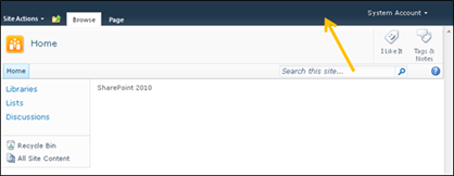
This would allow for more horizontal space for the navigation items. However in my attempt to move the search I found a little gotcha. I selected the search control in SharePoint Designer and moved it right above the welcome navigation control code.
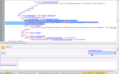
Wrapped the control in a div tag and temporarily added an inline style of float left.
<div style="float: left;">
<asp:ContentPlaceHolder id="PlaceHolderSearchArea" runat="server">
<SharePoint:DelegateControl runat="server" ControlId="SmallSearchInputBox" Version="4"/>
</asp:ContentPlaceHolder>
</div>

I saved the master page and then checked out what it looked like. The search was moved up correctly but it was not until I used IE8 dev toolbar to check for compatibility in IE7.
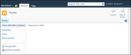
As you can see below in IE7 the search, and welcome link/drop down is no where to be seen and the ribbon tabs got all squished.

After doing some testing in IE7 mode an inline style gets applied to the ms-cui-TabRowRight with “Display: none”
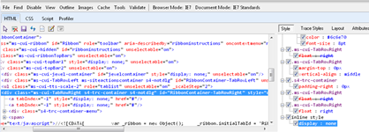
I am not 100% why this is, but if I try to put the search anywhere else in the ribbon it just does not show… So I guess this is more of a warning to the designers out there. If you are thinking about putting the search in the top ribbon bar in your design comps know that there might be some issues with browser compatibility.
So what I ended up doing is moving the search to the left of the Social Notification tags. Wrapped it in a <td> tag and called it a day. The client was happy with the results since they were still able to have their navigation items and the search moved to a different location.


Please comment on this post if you have seen this issue before or have found a fix. Thanks!

This would allow for more horizontal space for the navigation items. However in my attempt to move the search I found a little gotcha. I selected the search control in SharePoint Designer and moved it right above the welcome navigation control code.

Wrapped the control in a div tag and temporarily added an inline style of float left.
<div style="float: left;">
<asp:ContentPlaceHolder id="PlaceHolderSearchArea" runat="server">
<SharePoint:DelegateControl runat="server" ControlId="SmallSearchInputBox" Version="4"/>
</asp:ContentPlaceHolder>
</div>

I saved the master page and then checked out what it looked like. The search was moved up correctly but it was not until I used IE8 dev toolbar to check for compatibility in IE7.

As you can see below in IE7 the search, and welcome link/drop down is no where to be seen and the ribbon tabs got all squished.

After doing some testing in IE7 mode an inline style gets applied to the ms-cui-TabRowRight with “Display: none”

I am not 100% why this is, but if I try to put the search anywhere else in the ribbon it just does not show… So I guess this is more of a warning to the designers out there. If you are thinking about putting the search in the top ribbon bar in your design comps know that there might be some issues with browser compatibility.
So what I ended up doing is moving the search to the left of the Social Notification tags. Wrapped it in a <td> tag and called it a day. The client was happy with the results since they were still able to have their navigation items and the search moved to a different location.


Please comment on this post if you have seen this issue before or have found a fix. Thanks!
Sunday, April 18, 2010
SharePoint Tab Web Part JQuery, Java, and CSS
I have been searching for a simple tab web part for SharePoint but mostly came up empty handed… I was looking for something that a user can easily drag and drop a web part onto a specific tab within the page. There are quite a few free tab web parts out there but most of them were not just quite what I wanted. I checked out the following Tab web part solutions.
http://www.bitsofsharepoint.com/ExamplePoint/Site/TabPage.aspx
His code was exactly what I needed. All I had to do was make a few adjustments of the HTML and create my own tab styles. The process to get this to work is you simply edit the page layout in the source link below (Code is already included in header control) and change the name of the tabs to what ever you want. You can have as many tabs as you want but if you go over 8 you will need to add more web part zones.
<li><a href="#tab-1" class="selected"><span>Tab1</span></a></li>
<li><a href="#tab-2" ><span>Tab2</span></a></li>
<li><a href="#tab-3" ><span>Tab3</span></a></li>
Once you have your tabs specified, simply choose what design you want. I created a few example designs that will get you started. To change the designs simply remove the commented out referenced style sheet and comment out the one you don’t want. You can place the support files anywhere you want but the links in the page layout point to the 12 hive: /_layouts/1033/styles/tabstyles/
For inspiration, I looked around the web and found a few unique styles that I wanted to replicate, and I also came up with a few of my own. Please download the Source Files HERE and give it a try!
Design 1: MSN

Design 2: Yahoo

Design 3: WebMD

Design 3a: WebMD Alt

Design 4: Rounded Tabs 1

Design 5: Rounded Tabs 2

Drop me a comment if you found this useful!
- Easy Tabs: From Path To SharePoint
- Pro: The tabs automatically take the name of the web part.
- Con: There is no option to add more than one web part per tab, and the User Interface is not that intuitive.
- Zone Tabs: From MSDN
- Pro: You have a lot of options for tab customization
- Con: It’s a web part that you have to install on the server. From what I remember it’s not that easy to re-arrange the web parts on the page.
http://www.bitsofsharepoint.com/ExamplePoint/Site/TabPage.aspx
His code was exactly what I needed. All I had to do was make a few adjustments of the HTML and create my own tab styles. The process to get this to work is you simply edit the page layout in the source link below (Code is already included in header control) and change the name of the tabs to what ever you want. You can have as many tabs as you want but if you go over 8 you will need to add more web part zones.
<li><a href="#tab-1" class="selected"><span>Tab1</span></a></li>
<li><a href="#tab-2" ><span>Tab2</span></a></li>
<li><a href="#tab-3" ><span>Tab3</span></a></li>
Once you have your tabs specified, simply choose what design you want. I created a few example designs that will get you started. To change the designs simply remove the commented out referenced style sheet and comment out the one you don’t want. You can place the support files anywhere you want but the links in the page layout point to the 12 hive: /_layouts/1033/styles/tabstyles/
For inspiration, I looked around the web and found a few unique styles that I wanted to replicate, and I also came up with a few of my own. Please download the Source Files HERE and give it a try!
Design 1: MSN

Design 2: Yahoo

Design 3: WebMD

Design 3a: WebMD Alt

Design 4: Rounded Tabs 1

Design 5: Rounded Tabs 2

Drop me a comment if you found this useful!
Thursday, February 25, 2010
Datasheet View Background Color Issue
As you design your sites it is very critical that you test, test, test. Here is a common issue that has caused a lot of people headache in the past. If you have ever had the issue of your datasheet background color being the same color as the body of your site here is a fix to get it back to normal.
Say you wanted a SharePoint design that was fixed width and center justified. This is pretty easy as long as you don’t change the body color to anything other than white.
Example: Fixed Width site with dark body background.

You might think to use the following CSS:
body{
background-color:#000;
text-align: center;
}
.ms-main{
margin:0 auto;
width: 980px;
background-color:#FFF;
}
#mainTable{
width: 100%;
}
Well that would be great if you never wanted to use the datasheet viewer… Here is how it looks with the CSS from above:
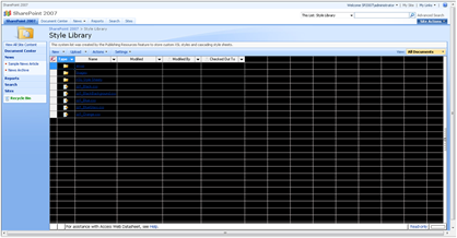
Whoa… Look familiar? Well with just using the following classes you can keep the background color for your site but not show it in the datasheet view.
form#aspnetForm{
background-color:#000;
height: 100%;
text-align: center;
}
body{
background-color:#FFF; text-align: center;
}
.ms-main{
margin:0 auto;
width: 980px;
background-color:#FFF;
}
#mainTable{
width: 100%;
}
Simply add your background color or image to the form#aspnetForm class and keep the body background to white and you should be golden! Here is what your datasheet view will look like now:

Hope you find this helpful!
Say you wanted a SharePoint design that was fixed width and center justified. This is pretty easy as long as you don’t change the body color to anything other than white.
Example: Fixed Width site with dark body background.

You might think to use the following CSS:
body{
background-color:#000;
text-align: center;
}
.ms-main{
margin:0 auto;
width: 980px;
background-color:#FFF;
}
#mainTable{
width: 100%;
}
Well that would be great if you never wanted to use the datasheet viewer… Here is how it looks with the CSS from above:

Whoa… Look familiar? Well with just using the following classes you can keep the background color for your site but not show it in the datasheet view.
form#aspnetForm{
background-color:#000;
height: 100%;
text-align: center;
}
body{
background-color:#FFF; text-align: center;
}
.ms-main{
margin:0 auto;
width: 980px;
background-color:#FFF;
}
#mainTable{
width: 100%;
}
Simply add your background color or image to the form#aspnetForm class and keep the body background to white and you should be golden! Here is what your datasheet view will look like now:

Hope you find this helpful!
Monday, February 1, 2010
SharePoint 2010 Layered Photoshop File!
I am in the mood for sharing today so here is a great starter file to get your new design rolling. I created one for 2007 and now here is one for SharePoint 2010. I increased the resolution to 1280x800.

Download it Here.

Download it Here.
Monday, January 25, 2010
SharePoint 2010 Themes
As you all know SharePoint has a new theme engine for 2010. You can do cool things such as create a theme in PowerPoint, export it and then import it into SharePoint 2010, click apply and you got a custom theme. One aspect that I could not find documented is the definition of when you choose a color for a particular element what is it really changing?
If you modify the theme for a site you can use the picker to choose a OOTB or custom theme. Or you have the ability to choose your own color scheme via the following elements.

My approach: Make each element white to start with and then one by one add color and document the results. Just for kicks here is what it looks like when it is completely white… (not a color scheme I would recommend…) I will be using a red color: #C12345 for testing.

Here are the details for each one of the elements above:
Text/Background- Dark 1 (41 Classes)
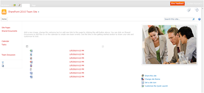
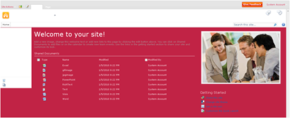


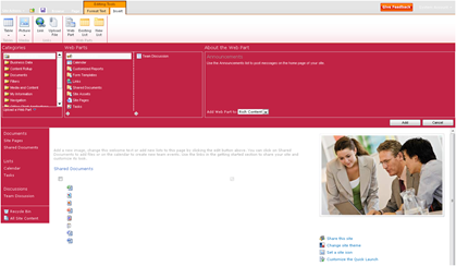
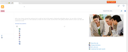


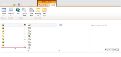
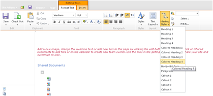


If you modify the theme for a site you can use the picker to choose a OOTB or custom theme. Or you have the ability to choose your own color scheme via the following elements.

My approach: Make each element white to start with and then one by one add color and document the results. Just for kicks here is what it looks like when it is completely white… (not a color scheme I would recommend…) I will be using a red color: #C12345 for testing.

Here are the details for each one of the elements above:
Text/Background- Dark 1 (41 Classes)

- Page Title Hyperlink Text
- Hover Text
- VB Body Text
- Site Action Menu Text
- Left Navigation Links Text
- Site Setting Page Text Headers

- Body Background
- Toolbar Background
- Quick Launch Borders
- Web Part Header Background
- Site Action Menu Background
- Site Action/Welcome Text Color
- Pop-Up Window Background

- Top Banner Background
- Left Navigation Header Text
- Recycle Bin/View All Site Content Text
- I Like/Tags Notes Text
- Library Column Text
- Site Action Drop Down Border
- Breadcrumb Current Location Text
- List Description Text


- Browse Tab and hover Background
- Title Container Background
- Top Links/Header 2 Background
- Quick Launch Background
- Web Part Adder Background

- Quick Launch Hover Text
- Top Link Selected Tab

- .ms-error
- Rich Text Colored Heading 2 Text Styles

- Rich Text “Caption” Style Text Color

- Border Under Web Part Selector

- Rich Text Colored Heading 4 Text Styles

- Rich Text Highlight background color

- Toolbar Text Color
- VB Body Hyperlink Text
- a:link Class Text Color
- Web Part Title Hyperlink Text (Not Visited)
- .ms-WPBody a:visited
- a:visited
Friday, January 22, 2010
Style Individual Navigation Items for 2007 & 2010
Here is a simple yet effective way to stylize individual top navigation items for SharePoint 2007 & 2010 just using CSS. SharePoint 2010 will need a slight modification to the master page but the same effect can be achieved. See bottom of post for 2010 implementation.
To start off with lets review how this can be accomplished for 2007. SharePoint 2007 provides a unique ID for each note in the navigation.

So you might ask well what can I do with this unique ID? Well here is a quick sample of what you can do. Its not pretty but it shows off that you can have a custom Icon, background color, font, etc. for each node in the navigation.

Here is the CSS and OOTB Icon references that I used to create the above design. So how does it work? Basically it combines the trigger of the unique ID and attaches it to the class of “ms-topnav a”. You will notice that I had to do a funky bit of css to fill in the background behind the arrow for news.
.ms-topnav{
border: none;
background-color: transparent;
background-image: none;
font-weight: bold;
}
#zz1_TopNavigationMenun0 .ms-topnav a{
background-image: url(/_layouts/images/newshomepage.png);
background-repeat: no-repeat;
background-position: -40px -3px;
background-color: #006699;
border: 1px #006699 solid !important;
padding:18px 20px 0px 80px;
height: 54px;
color: #FFF;
}
#zz1_TopNavigationMenun1 .ms-topnav a{
background-image: url(/_layouts/images/PLICON.PNG);
background-repeat: no-repeat;
background-position: -40px -3px;
background-color: #FF9933;
border: 1px #FF9933 solid !important;
padding:18px 20px 0px 80px;
height: 54px;
color: #FFF;
}
#zz1_TopNavigationMenun2 .ms-topnav a{
background-image: url(/_layouts/images/ANNOUNCE.PNG);
background-repeat: no-repeat;
background-position: -40px -3px;
background-color: #336633;
border: 1px #336633 solid !important;
padding:18px 20px 0px 80px;
height: 54px;
color: #FFF;
}
#zz1_TopNavigationMenun2 .ms-topnav td{
background-color: #336633;
}
#zz1_TopNavigationMenun3 .ms-topnav a{
background-image: url(/_layouts/images/ReportCenter.png);
background-repeat: no-repeat;
background-position: -40px -3px;
background-color: #990000;
border: 1px #990000 solid !important;
padding:18px 20px 0px 80px;
height: 54px;
color: #FFF;
}
#zz1_TopNavigationMenun4 .ms-topnav a{
background-image: url(/_layouts/images/SMT_LARGE.PNG);
background-repeat: no-repeat;
background-position: -40px -3px;
background-color: #660066;
border: 1px #660066 solid !important;
padding:18px 20px 0px 80px;
height: 54px;
color: #FFF;
}
#zz1_TopNavigationMenun5 .ms-topnav a{
background-image: url(/_layouts/images/categories.png);
background-repeat: no-repeat;
background-position: -40px -3px;
background-color: #999;
border: 1px #999 solid !important;
padding:18px 20px 0px 80px;
height: 54px;
color: #FFF;
}
So how do you do this for SharePoint 2010…
Well first you will need to modify the master page and do a search for “UseSimpleRendering="true"”. This basically tells SharePoint to render the navigation using a clean unordered list <UL> <LI> format.
Since this is so clean, it does not have any unique ID’s attached to it like it did in SharePoint 2007.

So if you change it to false: UseSimpleRendering="false" you can clearly see that each node now has a unique ID:

So if we simply take the same approach for 2007 we can get similar results. You will notice the only difference in the ID’s from 2007 to 2010 is that they put in a “V4” after the word “Menu” and before the “n#”

Below is the CSS that I used to achieve the design above for SharePoint 2010. Remember you need to make that modification to the master page noted above to get this to work. Also notice that I kept the “a” reference at the end of each ID.
#s4-topheader2{
border: none;
background-color: transparent;
background-image: none;
font-weight: bold;
height: 54px;
padding-bottom: 5px;
}
#zz1_TopNavigationMenuV4n0 a{
background-image: url(/_layouts/images/newshomepage.png);
background-repeat: no-repeat;
background-position: -40px -3px;
background-color: #006699;
border: 1px #006699 solid !important;
padding:18px 20px 18px 80px;
color: #FFF;
}
#zz1_TopNavigationMenuV4n1 a{
background-image: url(/_layouts/images/PLICON.PNG);
background-repeat: no-repeat;
background-position: -40px -3px;
background-color: #FF9933;
border: 1px #FF9933 solid !important;
padding:18px 20px 18px 80px;
color: #FFF;
}
#zz1_TopNavigationMenuV4n2 a{
background-image: url(/_layouts/images/ANNOUNCE.PNG);
background-repeat: no-repeat;
background-position: -40px -3px;
background-color: #336633;
border: 1px #336633 solid !important;
padding:18px 20px 18px 80px;
color: #FFF;
}
#zz1_TopNavigationMenuV4n3 a{
background-image: url(/_layouts/images/ReportCenter.png);
background-repeat: no-repeat;
background-position: -40px -3px;
background-color: #990000;
border: 1px #990000 solid !important;
padding:18px 20px 18px 80px;
color: #FFF;
}
#zz1_TopNavigationMenuV4n4 a{
background-image: url(/_layouts/images/SMT_LARGE.PNG);
background-repeat: no-repeat;
background-position: -40px -3px;
background-color: #660066;
border: 1px #660066 solid !important;
padding:18px 20px 18px 80px;
color: #FFF;
}
#zz1_TopNavigationMenuV4n5 a{
background-image: url(/_layouts/images/categories.png);
background-repeat: no-repeat;
background-position: -40px -3px;
background-color: #999;
border: 1px #999 solid !important;
padding:18px 20px 18px 80px;
color: #FFF;
}
Enjoy!
To start off with lets review how this can be accomplished for 2007. SharePoint 2007 provides a unique ID for each note in the navigation.
- 1st Tab: Dedicated as your default Home or root node
- ID: zz1_TopNavigationMenun0
- 2nd Tab: This is the first child node from the root
- ID: zz1_TopNavigationMenun1
- 3rd Tab: This is the second child node from the root
- ID: zz1_TopNavigationMenun2
- 4th Tab: This is the third child node from the root
- ID: zz1_TopNavigationMenun3

So you might ask well what can I do with this unique ID? Well here is a quick sample of what you can do. Its not pretty but it shows off that you can have a custom Icon, background color, font, etc. for each node in the navigation.

Here is the CSS and OOTB Icon references that I used to create the above design. So how does it work? Basically it combines the trigger of the unique ID and attaches it to the class of “ms-topnav a”. You will notice that I had to do a funky bit of css to fill in the background behind the arrow for news.
.ms-topnav{
border: none;
background-color: transparent;
background-image: none;
font-weight: bold;
}
#zz1_TopNavigationMenun0 .ms-topnav a{
background-image: url(/_layouts/images/newshomepage.png);
background-repeat: no-repeat;
background-position: -40px -3px;
background-color: #006699;
border: 1px #006699 solid !important;
padding:18px 20px 0px 80px;
height: 54px;
color: #FFF;
}
#zz1_TopNavigationMenun1 .ms-topnav a{
background-image: url(/_layouts/images/PLICON.PNG);
background-repeat: no-repeat;
background-position: -40px -3px;
background-color: #FF9933;
border: 1px #FF9933 solid !important;
padding:18px 20px 0px 80px;
height: 54px;
color: #FFF;
}
#zz1_TopNavigationMenun2 .ms-topnav a{
background-image: url(/_layouts/images/ANNOUNCE.PNG);
background-repeat: no-repeat;
background-position: -40px -3px;
background-color: #336633;
border: 1px #336633 solid !important;
padding:18px 20px 0px 80px;
height: 54px;
color: #FFF;
}
#zz1_TopNavigationMenun2 .ms-topnav td{
background-color: #336633;
}
#zz1_TopNavigationMenun3 .ms-topnav a{
background-image: url(/_layouts/images/ReportCenter.png);
background-repeat: no-repeat;
background-position: -40px -3px;
background-color: #990000;
border: 1px #990000 solid !important;
padding:18px 20px 0px 80px;
height: 54px;
color: #FFF;
}
#zz1_TopNavigationMenun4 .ms-topnav a{
background-image: url(/_layouts/images/SMT_LARGE.PNG);
background-repeat: no-repeat;
background-position: -40px -3px;
background-color: #660066;
border: 1px #660066 solid !important;
padding:18px 20px 0px 80px;
height: 54px;
color: #FFF;
}
#zz1_TopNavigationMenun5 .ms-topnav a{
background-image: url(/_layouts/images/categories.png);
background-repeat: no-repeat;
background-position: -40px -3px;
background-color: #999;
border: 1px #999 solid !important;
padding:18px 20px 0px 80px;
height: 54px;
color: #FFF;
}
So how do you do this for SharePoint 2010…
Well first you will need to modify the master page and do a search for “UseSimpleRendering="true"”. This basically tells SharePoint to render the navigation using a clean unordered list <UL> <LI> format.
Since this is so clean, it does not have any unique ID’s attached to it like it did in SharePoint 2007.

So if you change it to false: UseSimpleRendering="false" you can clearly see that each node now has a unique ID:

So if we simply take the same approach for 2007 we can get similar results. You will notice the only difference in the ID’s from 2007 to 2010 is that they put in a “V4” after the word “Menu” and before the “n#”
- 2007 ID: zz1_TopNavigationMenun0
- 2010 ID: zz1_TopNavigationMenuV4n0

Below is the CSS that I used to achieve the design above for SharePoint 2010. Remember you need to make that modification to the master page noted above to get this to work. Also notice that I kept the “a” reference at the end of each ID.
#s4-topheader2{
border: none;
background-color: transparent;
background-image: none;
font-weight: bold;
height: 54px;
padding-bottom: 5px;
}
#zz1_TopNavigationMenuV4n0 a{
background-image: url(/_layouts/images/newshomepage.png);
background-repeat: no-repeat;
background-position: -40px -3px;
background-color: #006699;
border: 1px #006699 solid !important;
padding:18px 20px 18px 80px;
color: #FFF;
}
#zz1_TopNavigationMenuV4n1 a{
background-image: url(/_layouts/images/PLICON.PNG);
background-repeat: no-repeat;
background-position: -40px -3px;
background-color: #FF9933;
border: 1px #FF9933 solid !important;
padding:18px 20px 18px 80px;
color: #FFF;
}
#zz1_TopNavigationMenuV4n2 a{
background-image: url(/_layouts/images/ANNOUNCE.PNG);
background-repeat: no-repeat;
background-position: -40px -3px;
background-color: #336633;
border: 1px #336633 solid !important;
padding:18px 20px 18px 80px;
color: #FFF;
}
#zz1_TopNavigationMenuV4n3 a{
background-image: url(/_layouts/images/ReportCenter.png);
background-repeat: no-repeat;
background-position: -40px -3px;
background-color: #990000;
border: 1px #990000 solid !important;
padding:18px 20px 18px 80px;
color: #FFF;
}
#zz1_TopNavigationMenuV4n4 a{
background-image: url(/_layouts/images/SMT_LARGE.PNG);
background-repeat: no-repeat;
background-position: -40px -3px;
background-color: #660066;
border: 1px #660066 solid !important;
padding:18px 20px 18px 80px;
color: #FFF;
}
#zz1_TopNavigationMenuV4n5 a{
background-image: url(/_layouts/images/categories.png);
background-repeat: no-repeat;
background-position: -40px -3px;
background-color: #999;
border: 1px #999 solid !important;
padding:18px 20px 18px 80px;
color: #FFF;
}
Enjoy!
Monday, January 18, 2010
SharePoint 2010 CSS references in Master Pages
Here are some of the most common ways to reference your custom CSS for SharePoint 2010. One key change over 2007 is the ability to specify After=”corev4.css” in the CssRegistration to make sure your custom CSS is referenced after the OOTB corev4.css file.
<SharePoint:CssLink runat="server" Version="4"/> Note: Default OOTB
Output Order:
Output Order:
Output Order:
Output Order:
Output Order:
<SharePoint:CssRegistration name="<% $SPUrl:~sitecollection/Style Library/~language/Themable/Core Styles/samplecustom.css %>" After="corev4.css" runat="server"/> Note: Alternate CSS In SharePoint Database for sites with publishing enabled
Output Order:
Output Order:
<SharePoint:CssLink runat="server" Version="4"/> Note: Default OOTB
Output Order:
- <link rel="stylesheet" type="text/css" href="/_layouts/1033/styles/Themable/corev4.css"/>
Output Order:
- <link rel=”stylesheet” type=”text/css” href=”/_themes/[UniqueCounter#]/corev4-[u=UniqueHex#].css?ctag=[UniqueCounter#]”/>
Output Order:
- <link rel="stylesheet" type="text/css" href="/_layouts/1033/styles/customfolder/samplecustom.css"/>
- <link rel="stylesheet" type="text/css" href="/_layouts/1033/styles/Themable/corev4.css"/>
Output Order:
- <link rel="stylesheet" type="text/css" href="/_layouts/1033/styles/Themable/corev4.css"/>
- <link rel="stylesheet" type="text/css" href="/_layouts/1033/styles/customfolder/samplecustom.css"/>
Output Order:
- <link rel="stylesheet" type="text/css" href="/_layouts/1033/styles/Themable/corev4.css"/>
- <link rel="stylesheet" type="text/css" href="/Style%20Library/emc_2010_custom.css"/>
<SharePoint:CssRegistration name="<% $SPUrl:~sitecollection/Style Library/~language/Themable/Core Styles/samplecustom.css %>" After="corev4.css" runat="server"/> Note: Alternate CSS In SharePoint Database for sites with publishing enabled
Output Order:
- <link rel="stylesheet" type="text/css" href="/_layouts/1033/styles/Themable/corev4.css"/>
- <link rel="stylesheet" type="text/css" href="/[sitename]/Style%20Library/en-US/Themable/Core%20Styles/emc_2010_custom.css"/>
Output Order:
- <link rel="stylesheet" type="text/css" href="/_layouts/1033/styles/Themable/corev4.css"/>
- <link rel="stylesheet" type="text/css" href="/_layouts/1033/styles/customfolder/samplecustom.css" />
Wednesday, January 13, 2010
Change SharePoint Search Icon with Just CSS
I created a post awhile ago on how to change the SharePoint site logo via CSS so that you don’t have to modify the titlegraphic.gif file on the file server or change it via the UI for every site to make a global change.
I have a simple solution that changes the search GO icon from the standard to something more custom
  with just CSS.
The icon is not specified via the master page so you will not be able to change it there.
<asp:ContentPlaceHolder id="PlaceHolderSearchArea" runat="server">
<SharePoint:DelegateControl runat="server" ControlId="SmallSearchInputBox" />
</asp:ContentPlaceHolder>
You might be tempted take the route of changing the following files on the server and replacing them with your own custom ones. But I have an alternative that works just as well and you don’t have to mess with any of these base Image files.
Upload your custom images to a sub folder within the following directory: C:\Program Files\Common Files\Microsoft Shared\Web Server Extensions\12\TEMPLATE\IMAGES\YourCustomFolder
Then in your custom CSS simply place the following CSS:
td.ms-sbgo{
background-color:transparent;
padding-left:3px;
padding-right:3px;
padding-bottom:0px;
padding-top:0px;
border:solid 0px #949494;
}
td.ms-sbgo a{
padding: 0px 0px 0px 0px !important;
margin: 0px 0px 0px 0px !important;
}
td.ms-sbgo a{
background-image: url(/_layouts/images/yourcustomfolder/custom_search.gif);
background-repeat: no-repeat;
background-position: top left;
}
td.ms-sbgo a img{
visibility: hidden;
height: 17px;
width: 17px;
}
You will simply just have to change the folder name, image name, and the height and width of the image to be specific to you and you should be good to go. The result should look something like this:

Happy Customizing!
I have a simple solution that changes the search GO icon from the standard
The icon is not specified via the master page so you will not be able to change it there.
<asp:ContentPlaceHolder id="PlaceHolderSearchArea" runat="server">
<SharePoint:DelegateControl runat="server" ControlId="SmallSearchInputBox" />
</asp:ContentPlaceHolder>
You might be tempted take the route of changing the following files on the server and replacing them with your own custom ones. But I have an alternative that works just as well and you don’t have to mess with any of these base Image files.
- GOSEARCH.GIF
- ICONGO01.GIF
- ICONGO02.GIF
- ICONGO03.GIF
Upload your custom images to a sub folder within the following directory: C:\Program Files\Common Files\Microsoft Shared\Web Server Extensions\12\TEMPLATE\IMAGES\YourCustomFolder
Then in your custom CSS simply place the following CSS:
td.ms-sbgo{
background-color:transparent;
padding-left:3px;
padding-right:3px;
padding-bottom:0px;
padding-top:0px;
border:solid 0px #949494;
}
td.ms-sbgo a{
padding: 0px 0px 0px 0px !important;
margin: 0px 0px 0px 0px !important;
}
td.ms-sbgo a{
background-image: url(/_layouts/images/yourcustomfolder/custom_search.gif);
background-repeat: no-repeat;
background-position: top left;
}
td.ms-sbgo a img{
visibility: hidden;
height: 17px;
width: 17px;
}
You will simply just have to change the folder name, image name, and the height and width of the image to be specific to you and you should be good to go. The result should look something like this:
Happy Customizing!
Great Post
ReplyDelete