Update: Really Small SharePoint Calendar
I really was not that happy with the look of the first calendar so after some modifications and a bit of CSS magic I have come up with a really good looking small calendar. At least I think so…
Basically I have replaced the text of an event item with a color coded box. The benefit that you get out of this is that you don’t have to try and read the even within the small calendar but if you hover over and click on the color block you get the list Item display.


Here is the CSS Code: Download Here

Leave a comment and let me know how it works for you!
Basically I have replaced the text of an event item with a color coded box. The benefit that you get out of this is that you don’t have to try and read the even within the small calendar but if you hover over and click on the color block you get the list Item display.
- Orange is for single event items (8am-10am, etc)
- Green is for full day events or repeat events


Here is the CSS Code: Download Here
- Simply place a content editor web part on the same page as the calendar
- Paste the code from the file above into the source of the content editor web part.
- Hide the Content editor web part on the page.

Leave a comment and let me know how it works for you!
Friday, October 30, 2009
How to create a really small SharePoint Calendar
Well I guess I did not do my research enough and found a site that had an even smaller SharePoint calendar by just modifying the CSS. http://pathtosharepoint.wordpress.com/2008/10/06/tiny-sharepoint-calendar-1/
With these styles below you can drastically transform your SharePoint Calendar view into a tiny box. Yes there is limited functionality but if you have been looking for something like this with no custom code you got it!
(Left) No events (Right) Events populated


Copy this CSS code below and past it into your custom CSS!
/* Remove week blocks */
.ms-cal-weekempty {display:none;}
.ms-cal-week {display:none;}
.ms-cal-weekB {display:none;}
.ms-cal-weekB {display:none;}
/* Shrink cells */
.ms-cal-workitem2B {display:none;}
.ms-cal-noworkitem2B {display:none;}
.ms-cal-nodataBtm2 {display:none;}
.ms-cal-todayitem2B {display:none;}
.ms-cal-workitem {font-size:0px;}
.ms-cal-muworkitem {font-size:0px;}
.ms-cal-noworkitem {font-size:0px;}
.ms-cal-nodataMid {font-size:0px;}
.ms-cal-todayitem {font-size:0px;}
/* thin out header */
.ms-cal-nav {display:none;}
.ms-cal-nav-buttonsltr {display:none;}
.ms-cal-navheader {padding:0px;spacing:0px;}
.ms-calheader IMG {width:15px;}
/* Abbreviate weekdays */
.ms-cal-weekday {letter-spacing:6px; width:22px; overflow: hidden;}
/* Adds border to bottom */
#CalViewTable1{
border-bottom: 1px #6f9dd9 solid;
}
Enjoy!
Wednesday, October 21, 2009
How to Shrink a SharePoint Calendar View
Have you ever needed to add a Event Calendar to your Team Site with the calendar view but you didn’t because it basically took up the whole site? Well just today I was messing around with this and came up with some interesting results.
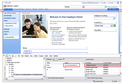
If you look at the code for a calendar view everything looks fine except for a hidden shared class at the very top of the calendar right below the webpart title.
 This image is 742 pixels wide and forces the calendar view to be minimally that width. With the CSS below you can now hide that image and allow the calendar to fit within your team site with no problems at all. By making these changes you will not change the look of the full view of the calendar when you click on the event list. The screenshot below was taken with 1024x768 resolution.
 Here is the CSS:
.ms-calheader img{
display: none;
}
#CalViewTable12 img{
display: inline;
}
.ms-cal-nav-buttonsltr{
white-space: nowrap;
}
Full Calendar View with styles applied:

Enjoy!
Thursday, June 4, 2009
SharePoint Branding Build Test Checklist
During the creation of the CSS, Master Pages, and Page layouts its critical to stay on top of your Front End Development testing.
As you know many classes in SharePoint are shared classes so when you make a modification to one element you have to test, test, test.
Below are some helpful things to review before giving that oh so critical demo… Hopefully these will help you out during your development process and testing.
As you know many classes in SharePoint are shared classes so when you make a modification to one element you have to test, test, test.
Below are some helpful things to review before giving that oh so critical demo… Hopefully these will help you out during your development process and testing.
- Create and test all OOTB SharePoint templates
- Publishing Sites
- Publishing Toolbar
- Page Layouts (All that are available)
- My Sites
- My Profile
- Organization Hierarchy web part
- In Common with you web part
- My Profile
- Team Sites
- Meeting Workspaces
- Tabs
- Recurring Meeting Workspaces Quick Launch
- Blog
- Unique Quick Launch
- Post date, title, content, and links
- Wiki
- Functional Links (Edit, History, Incoming Links)
- Unique Quick Launch (Recent Changes)
- Last Modified
- Search
- People search drop down options
- Search Results
- Advanced Search Link
- Advanced Search Page
- Central Administration
- Don’t spend to much time on these
- Publishing Sites
- Test as many SharePoint functions as you can
- Fly Out Menu’s/Drop Downs
- My Links
- Top Navigation
- Site Actions
- Modify Web Part
- Quick Launch if enabled
- Multi Tier/level if enabled
- Document Item Drop Down
- Button Hovers
- Search/Go
- Global Links (Top Links like My Links)
- SPLink (Welcome & Console Toolbar Buttons)
- Toolbar View Button
- Quick Launch
- Headers
- List Items
- Selected headers/Items
- Tree View
- Breadcrumbs
- Text
- Hyperlinks
- Carrots “>”
- Toolbars
- Calendar
- Date Picker
- Month View
- Week View
- Day View
- Current Day Indicators
- Lists/Libraries
- Datasheet View
- Alternating item shade (ms-alternating)
- Webpart
- Chrome/Title
- Border color/width if selected (ms-WPBorder)
- Separator Lines
- Edit Page
- Webpart Zone Colors
- Drag and Drop Style
- Webpart Chrome/Title’s
- Advanced Webpart Gallery and Options
- Admin Pages
- Site Settings
- List Forms
- Form Background (ms-authoringcontrols)
- Upload Document
- Error Pages
- OOTB Themes
- If you are going to allow OOTB themes you will have to test, test, and triple test that all themes work and function as expected with your custom design…
- Fonts/Colors
- Stick to system Fonts so that everyone gets the same experience. (Verdana, Tahoma, Arial, Etc)
- Page Titles
- Body Content
- Hyperlinks
- Hover Text
- Visited State
- Images
- Teamsite Default Image
- Social Meeting Workspace Image
- Customization/3rd Party
- Its kinda a given but any custom web parts, 3rd Party or custom controls implemented will need to have branding applied or tested before deployment onto prod servers.
- Fly Out Menu’s/Drop Downs
Thursday, May 14, 2009
Rounded Corners in SharePoint
Rounded corners have become a staple in website design. But they come with a price. Don't get me wrong I really like the look of them and they really help soften the look of the site.
In most cases you can create this look by using the method below. Later on in this post I will highlight some of the things you can do and some of the things not technically possible without major custom development.
Design 1: Rounded corners to frame a site:
background-image: url(/_layouts/images/xyz/xyz_content_corner_tl.gif);
background-position:left top;
background-repeat: no-repeat;
background-color: #ffffff;
}
#xyz--content-corner-tr{
background-image: url(/_layouts/images/xyz/xyz_content_corner_tr.gif);
background-position:right top;
background-repeat: no-repeat;
}
#xyz--content-corner-bl{
background-image: url(/_layouts/images/xyz/xyz_content_corner_bl.gif);
background-position:left bottom;
background-repeat: no-repeat;
height: 100%;
}
#xyz--content-corner-br{
background-image: url(/_layouts/images/xyz/xyz_content_corner_br.gif);
background-position:right bottom;
background-repeat: no-repeat;
height: 100%;
}
Example: Please note that the shadow effect is a bit more complex and requires two more <div> tags to represent the right side repeat and the bottom repeat.

Design 2: Rounded corners to frame content

Design 3: Rounded corners around individual web parts

So all in all its fairly easy to add in rounded corners to different areas within your design by using the approach above but there is still a need to have individual web parts with a container all for themselves.
If anyone out there has any ideas on either modifying the JavaScript to ignore the div tags and hide the empty zones or have any other approaches that have worked for them please don't hesitate to comment.
Thanks!
In most cases you can create this look by using the method below. Later on in this post I will highlight some of the things you can do and some of the things not technically possible without major custom development.
Design 1: Rounded corners to frame a site:
- Open up your master page and add 1 <div> tag right before the ms-main table to represent the site container (This is used to position the site and give it its width)
- Add 4 more <div> tags before the ms-main table to represent your 4 corners (top left, top right, bottom left, bottom right)
- <div id="xyz-content-corner-tl">
<div id="xyz-content-corner-tr">
<div id="xyz-content-corner-bl">
<div id="xyz-content-corner-br"> - Add in the following to CSS attributes to represent the 4 corners
background-image: url(/_layouts/images/xyz/xyz_content_corner_tl.gif);
background-position:left top;
background-repeat: no-repeat;
background-color: #ffffff;
}
#xyz--content-corner-tr{
background-image: url(/_layouts/images/xyz/xyz_content_corner_tr.gif);
background-position:right top;
background-repeat: no-repeat;
}
#xyz--content-corner-bl{
background-image: url(/_layouts/images/xyz/xyz_content_corner_bl.gif);
background-position:left bottom;
background-repeat: no-repeat;
height: 100%;
}
#xyz--content-corner-br{
background-image: url(/_layouts/images/xyz/xyz_content_corner_br.gif);
background-position:right bottom;
background-repeat: no-repeat;
height: 100%;
}
Example: Please note that the shadow effect is a bit more complex and requires two more <div> tags to represent the right side repeat and the bottom repeat.

Design 2: Rounded corners to frame content
- This approach can achieved the same way as per above with 4 <div> tags but just needs to included around the <asp:ContentPlaceHolder id="PlaceHolderMain" runat="server"> control within the master page.

Design 3: Rounded corners around individual web parts
- Now this one has some tricky elements that I am still trying to work out.
- My Original thought was to use the approach above and simply add the 4 <div> tags around each individual webpart zone in a page layout. But there is a catch…
- Normally webpart zones are wrapped in a <td> that has an id of "_invisibleIfEmpty" There is some java script that basically hides that zone from rendering on the page if there is no content in it.
- However if you place those 4 div tags within that <td> you would assume that it would still hide that zone. But no basically its like a buffer and that JavaScript no longer thinks that zone is empty and it shows it on the page even if there is no webpart in that zone. So you end up with something like below: Notice that below the two web parts on the right there are two empty white containers with nothing in them.

So all in all its fairly easy to add in rounded corners to different areas within your design by using the approach above but there is still a need to have individual web parts with a container all for themselves.
If anyone out there has any ideas on either modifying the JavaScript to ignore the div tags and hide the empty zones or have any other approaches that have worked for them please don't hesitate to comment.
Thanks!
Thursday, April 9, 2009
IA and Branding Process Presentation [Video]
Click to watch the video presentation (36MB WMV), thanks to my friend Paul Galvin for taking the video.
Update: For some reason the link was not good. I have updated it and it should work now.
Update: For some reason the link was not good. I have updated it and it should work now.
Wednesday, April 8, 2009
IA and Design Process Presentation Download!
I want to thank everyone for attending my presentation. It was a great success! I had a co-worker video record the session but it will take a little while to get that uploaded/edited for the masses.
Here is the link to my presentation. I have included notes on each slide for the dialog.
Download: http://cid-ed1a37150dabcd2d.skydrive.live.com/self.aspx/Public/IA%20and%20Branding%20Process%7C_ErikSwenson.pptx?ccr=80

Thanks again, enjoy and please add your comments to this post!
Here is the link to my presentation. I have included notes on each slide for the dialog.
Download: http://cid-ed1a37150dabcd2d.skydrive.live.com/self.aspx/Public/IA%20and%20Branding%20Process%7C_ErikSwenson.pptx?ccr=80

Thanks again, enjoy and please add your comments to this post!
Tuesday, March 31, 2009
User Experience Design Process: Teaser
As a teaser, I would like to provide a sample of my upcoming session at the SharePoint Summit 2009.
Roles:
UXD Process:

Roles:
 | Information Architecture –Much of the interface navigation and page structure will be driven by the Information Architect. |
 | Designer – Skill depends on several factors, if leveraging native features, skill is very dependent on knowledge of SharePoint. |
 | SharePoint Front-End Development – MOSS-FED highly specialized skill set, especially if doing CSS-based changes. |

Wednesday, January 28, 2009
Hide #1 tab in Top Navigation (Home)
OOTB SharePoint will not allow you to remove the 1st tab on the main navigation through the UI. To do this you can simply use the following CSS below and add it to your custom CSS or use the CEWP page style method to just make the change just for that page.
If you look at the code, you will notice that each top navigation item has an ID.
CSS Code:
#zz1_TopNavigationMenun0 {
display: none !important;
}
If you look at the code, you will notice that each top navigation item has an ID.
- zz1_TopNavigationMenun0 (Home Tab)
- zz1_TopNavigationMenun1 (Tab #2)
- zz1_TopNavigationMenun2 (Tab #3)
- zz1_TopNavigationMenun... (Tab Etc)
CSS Code:
#zz1_TopNavigationMenun0 {
display: none !important;
}
Friday, January 16, 2009
Creating a Two Tier Global Navigation
Two tier navigation is not a new concept and has been out for quite a long time. However SharePoint OOTB does not allow you to have a global navigation that spans multiple site collections.
Here are a few examples of a multi tier horizontal navigation.
Example 1: MSDN: Microsoft Developer Network

Example 2: Fed Ex

Example 3: Wall Street Journal

During a recent project I was given the task to create a global navigation that had two tiers like the examples above.
After some investigation my friend Sahil Malik had put together a great blog about creating a consistent navigation across site collections. (Thanks Buddy)
Well this is great and all but his code replaced the OOTB navigation with a custom one. So after some hard thinking I figured out that you could create your own control that drove the tier 1 global navigation (Across site collections) and a tier 2 local navigation (OOTB) that was security trimmed.
To get this to work you should use Shail's post as a guide for code but here are the basic steps:
<siteMap>
<siteMapNode title="Tab 1 Home" url="/Pages/Default.aspx">
<siteMapNode title="My Site" url="http://mysite.company.com/_layouts/mysite.aspx">
<siteMapNode title="My Profile" url="http://mysite.company.com/person.aspx"/>
</siteMapNode>
<siteMapNode title="Collaboration" url="/Collaboration/Pages/Default.aspx"/>
<siteMapNode title="News" url="/news/Pages/Default.aspx">
<siteMapNode title="News 1" url="/news/news1/Pages/default.aspx"/>
<siteMapNode title="News 2" url="/news/news2/Pages/default.aspx"/>
<siteMapNode title="News 3" url="/news/news3/Pages/default.aspx"/>
</siteMapNode>
</siteMapNode>
</siteMap>
Finding out the hard way you cannot have any of the siteMap Node elements have the same url or title...
Please note that if you are placing this custom control on the mysite the relative links will have to be changed to absolute due to the fact that they reside in different web applications.

Once you get it finally working your new navigation will have the following functions:

Have fun customizing, and drop me a line if you have created something similar!
Here are a few examples of a multi tier horizontal navigation.
Example 1: MSDN: Microsoft Developer Network
Example 2: Fed Ex

Example 3: Wall Street Journal

During a recent project I was given the task to create a global navigation that had two tiers like the examples above.
After some investigation my friend Sahil Malik had put together a great blog about creating a consistent navigation across site collections. (Thanks Buddy)
Well this is great and all but his code replaced the OOTB navigation with a custom one. So after some hard thinking I figured out that you could create your own control that drove the tier 1 global navigation (Across site collections) and a tier 2 local navigation (OOTB) that was security trimmed.
To get this to work you should use Shail's post as a guide for code but here are the basic steps:
- Go to: \inetpub\wwwroot\wss\VirtualDirectories\yourwebappname
- Create a back up of the web.config on each of the web applications that you want the two tier navigation
- Add the following to the custom web.config file
- Go to: \inetpub\wwwroot\wss\VirtualDirectories\yourwebappname\_app_bin
- Create a file called "mainMenu.sitemap" and add in your navigation simular to something like below
<siteMap>
<siteMapNode title="Tab 1 Home" url="/Pages/Default.aspx">
<siteMapNode title="My Site" url="http://mysite.company.com/_layouts/mysite.aspx">
<siteMapNode title="My Profile" url="http://mysite.company.com/person.aspx"/>
</siteMapNode>
<siteMapNode title="Collaboration" url="/Collaboration/Pages/Default.aspx"/>
<siteMapNode title="News" url="/news/Pages/Default.aspx">
<siteMapNode title="News 1" url="/news/news1/Pages/default.aspx"/>
<siteMapNode title="News 2" url="/news/news2/Pages/default.aspx"/>
<siteMapNode title="News 3" url="/news/news3/Pages/default.aspx"/>
</siteMapNode>
</siteMapNode>
</siteMap>
Finding out the hard way you cannot have any of the siteMap Node elements have the same url or title...
Please note that if you are placing this custom control on the mysite the relative links will have to be changed to absolute due to the fact that they reside in different web applications.
- Next you will have to add in the custom control to your masterpage. This can be a bit tricky.
- Copy the OOTB navigation control "<asp:ContentPlaceHolder id="PlaceHolderHorizontalNav" runat="server">"
- Place this control in a <TR> tag right above the OOTB navigation control
- Like in Sahil's blog post rename the DataSourceID= from in the custom control from "topSiteMap" to "xmlSiteMap"
- You will also need to modify the content placeholder and menu ID's see highlighted items below:

Once you get it finally working your new navigation will have the following functions:
- Tier 1: Global Navigation
- Always Consistent
- Not Security Trimmed
- Manually configured on the server Via XML (I'm sure if you wanted to get tricky you could hook this up to custom list or something...)
- Globally across site collections, web applications and even external applications if you wanted (Basically anything)
- Tier 2: OOTB Local Navigation
- Changes based on site collection
- Security Trimmed
- Configured through the UI
- Only shows navigation within the site collection

Have fun customizing, and drop me a line if you have created something similar!
Monday, January 5, 2009
Stylize Individual Web Parts with a CEWP
The following instructions describe how to change the title bar, background color, and webpart title for one or more web parts on a specific page or site.
1) Navigate to the page or site that requires the styling
2) View the browser’s source code for the page: Page > View Source (IE7) or Use IE developer Toolbar DOM Explorer
<table TOPLEVEL border="0" cellpadding="0" cellspacing="0" width="100%">
<tr>
<td>
<table border="0" cellpadding="0" cellspacing="0" width="100%">
<tr class="ms-WPHeader">
<td title="News" id="WebPartTitleWPQ2" style="width:100%;">
4) In one of the web part zones, add a new content editor web part. (It does not matter what zone this is added to since the web part will be hidden once editing is complete.)
/* Webpart Header Color */
# MSOZoneCell_WebPartWPQ2 .ms-wpheader td{
background-color: #006699;
}
/* Webpart Border Color */
# MSOZoneCell_WebPartWPQ2 .ms-wpborder{
border: 1px #FFCC00 solid;
background-color: #006699;
}
/* Webpart Title Text Color */
#MSOZoneCell_WebPartWPQ2 .ms-WPTitle A:link{
color:#FFFFFF;
}
/* Webpart Title Text Visited Color */
#MSOZoneCell_WebPartWPQ2 .ms-WPTitle A:visited{
color:#FFFFFF;
}
</Style>
7) Click “Exit edit mode” in the top right of the browser to return
8) Refresh the browser to see the styling changes made to the selected web part(s)
Note: This solution only effects the current page, and if the web part changes position in its current zone, or is moved to another zone, the custom branding will follow the web part to its new position on the page. SharePoint assigns these webpart ID's as you add each webpart to the page, so if the webpart is removed and then added back to the page the styling you might get some unexpected results.
This can be considered a quick and dirty method. There are other options that will span all pages using a particular page layout by adding a div tag with a particular class around a webpart zone for which you can set a style per webpart zone area and not the webpart itself.
Thanks and happy styling!
1) Navigate to the page or site that requires the styling
2) View the browser’s source code for the page: Page > View Source (IE7) or Use IE developer Toolbar DOM Explorer
- Search the source using the title of the web part that requires separate styling (i.e. “News”, "Links" etc.)
- From the “td” tag that contains the web part “title”, select the “id” from the grandparent “td” tag. For example, see the web part “title” and corresponding web part “id” highlighted below:
<table TOPLEVEL border="0" cellpadding="0" cellspacing="0" width="100%">
<tr>
<td>
<table border="0" cellpadding="0" cellspacing="0" width="100%">
<tr class="ms-WPHeader">
<td title="News" id="WebPartTitleWPQ2" style="width:100%;">
- In this case, the “id” for the “News” web part is “MSOZoneCell_WebPartWPQ2”
- Copy the “id” value
4) In one of the web part zones, add a new content editor web part. (It does not matter what zone this is added to since the web part will be hidden once editing is complete.)
- In the “Edit” menu of the new content editor web part, select “Modify shared web part”, and then select “Source Editor”
- In the pop-up window that appears, paste the following code, which includes the “id” value from the source code (here we use the example value in italics):
/* Webpart Header Color */
# MSOZoneCell_WebPartWPQ2 .ms-wpheader td{
background-color: #006699;
}
/* Webpart Border Color */
# MSOZoneCell_WebPartWPQ2 .ms-wpborder{
border: 1px #FFCC00 solid;
background-color: #006699;
}
/* Webpart Title Text Color */
#MSOZoneCell_WebPartWPQ2 .ms-WPTitle A:link{
color:#FFFFFF;
}
/* Webpart Title Text Visited Color */
#MSOZoneCell_WebPartWPQ2 .ms-WPTitle A:visited{
color:#FFFFFF;
}
</Style>
- Click “Save” in the pop-up window to save the changes
- Expand the “Layout” section in the editing pane that appears on the right-side of the browser window
- Select the check box labeled “Hidden” to ensure that the content editor web part will not be visible to users
- Click “OK” in the editing pane to complete editing the web part
- Under the “Edit” menu of this web part, select “Modify Shared Web part”
- Expand the “Appearance” section of the web part editing pane
- Scroll-down to the “Chrome Type” drop-down list and select “Title and Border”
- Click “OK” in the editing pane to save the new settings for the web part
7) Click “Exit edit mode” in the top right of the browser to return
8) Refresh the browser to see the styling changes made to the selected web part(s)
Note: This solution only effects the current page, and if the web part changes position in its current zone, or is moved to another zone, the custom branding will follow the web part to its new position on the page. SharePoint assigns these webpart ID's as you add each webpart to the page, so if the webpart is removed and then added back to the page the styling you might get some unexpected results.
This can be considered a quick and dirty method. There are other options that will span all pages using a particular page layout by adding a div tag with a particular class around a webpart zone for which you can set a style per webpart zone area and not the webpart itself.
Thanks and happy styling!
Friday, January 2, 2009
Presenting at SharePoint Summit 2009!
I have been selected to present at the 2009 SharePoint Summit in Montreal Canada on April 8th.
My Session: IA and Branding Process: Sketches to Wireframes to Hi-Fidelity Designs
Learn about proven methods to guide you from paper napkin sketches to hi-fidelity prototypes. Explore how to transition from each process and who is involved.
This session will entail the following:
http://www.interdoc.com/site/SharePointSummit2009/conference_day2.htm#session_7_2
My Session Bio: http://www.interdoc.com/site/SharePointSummit2009/biography.htm#eswenson
My Co-worker Paul Galvin will also be presenting as well.
Paul's Session: http://www.interdoc.com/site/SharePointSummit2009/tutorials.htm#tutorial_e
Paul's Session Bio: http://www.interdoc.com/site/SharePointSummit2009/biography.htm#pjgalvin
I hope to see you all there!
My Session: IA and Branding Process: Sketches to Wireframes to Hi-Fidelity Designs
Learn about proven methods to guide you from paper napkin sketches to hi-fidelity prototypes. Explore how to transition from each process and who is involved.
This session will entail the following:
- Methods to gathering requirements
- Benefits of a creative brief and Style guide
- Understand what functional concepts are and how they can be used
- Explore options on creating wireframes
- Creating the Design Composition (Differences between design adaptation and custom design)
- Building the design (CSS, Images, Master Pages, Page layouts, testing for multiple browsers and Mobile devices)
http://www.interdoc.com/site/SharePointSummit2009/conference_day2.htm#session_7_2
My Session Bio: http://www.interdoc.com/site/SharePointSummit2009/biography.htm#eswenson
My Co-worker Paul Galvin will also be presenting as well.
Paul's Session: http://www.interdoc.com/site/SharePointSummit2009/tutorials.htm#tutorial_e
Paul's Session Bio: http://www.interdoc.com/site/SharePointSummit2009/biography.htm#pjgalvin
I hope to see you all there!
Monday, November 17, 2008
Alternative way to Change Site Logo
OOTB SharePoint allows you to change the logo of the page from the default: titlegraphic.gif  to another image by going into site settings > Title, Description, and Icon.
The following method is a way to add a new logo to your page with just CSS. If you wanted to make this more global you will need to use an alternate method to override the default CSS classes.
.ms-titleimagearea{
background-image:url("/_layouts/images/xyzcorp.gif");
background-repeat: no-repeat;
background-position: top left;
}
#ctl00_onetidHeadbnnr0{
visibility: hidden;
height:130px;
width: 126px;
}
</STYLE>

Modified:

 to another image by going into site settings > Title, Description, and Icon.
The following method is a way to add a new logo to your page with just CSS. If you wanted to make this more global you will need to use an alternate method to override the default CSS classes.
- Upload your new logo to either the server or to a list on your site.
- Add a Content Editor webpart to the page.
- Add in the following to the source viewer.
.ms-titleimagearea{
background-image:url("/_layouts/images/xyzcorp.gif");
background-repeat: no-repeat;
background-position: top left;
}
#ctl00_onetidHeadbnnr0{
visibility: hidden;
height:130px;
width: 126px;
}
</STYLE>
- In the example above I have uploaded the xyzcorp.gif logo to the images folder on the server.
- Make sure you modify the elements above in bold green: logo name, height, and width (of logo).
- Save the page and you should now have the new logo on the page.

Modified:

Friday, October 24, 2008
A fix for the annoying line below the Main Navigation in publishing sites
There are some things in SharePoint that you just have to take a second to shake your head in disbelief on why it was built that way. In most cases if you have been working with SharePoint as long as I have your perception on what is normal is a little skewed... To this point on many of my designs I have worked around this little gem. In most cases it does not effect the designs or I could create a simple fix for it.
One of the functions of a publishing site the is not available for a WSS site is the "Page Editing Toolbar".
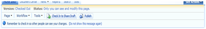
This toolbar is only suppose to be visible if you either click on Site Actions > Edit page, or Site Actions > Show Page Editing Toolbar. This is technically not the case. If you look at the screenshot below you will see that there is a 1px high by 100% wide background color of #79a7e3 from the toolbar showing through into the design in normal mode: Normally you would think this would be a border bottom to the main navigation but it is not.
 What I normally do is to take that "ms-consolemptablerow" class and just change the background color from #79a7e3 to "transparent".
This is especially important for designs that are very simple and do not need that extra line below the navigation.
Once you use the following css, the line will be removed.
.ms-consolemptablerow{
background-color: transparent;
}
You might ask yourself well how will this look if I edit the page and show the toolbar? Well this is where you start scratching your head... It actually is hidden from view when the toolbar is visible...
Try it for yourself, make the background red and view the page in non-edit mode, and then either view the toolbar or edit the page and see what happens... Its gone like Magic.
Go figure...
One of the functions of a publishing site the is not available for a WSS site is the "Page Editing Toolbar".

This toolbar is only suppose to be visible if you either click on Site Actions > Edit page, or Site Actions > Show Page Editing Toolbar. This is technically not the case. If you look at the screenshot below you will see that there is a 1px high by 100% wide background color of #79a7e3 from the toolbar showing through into the design in normal mode: Normally you would think this would be a border bottom to the main navigation but it is not.
 What I normally do is to take that "ms-consolemptablerow" class and just change the background color from #79a7e3 to "transparent".
 This is especially important for designs that are very simple and do not need that extra line below the navigation.

Once you use the following css, the line will be removed.
.ms-consolemptablerow{
background-color: transparent;
}
You might ask yourself well how will this look if I edit the page and show the toolbar? Well this is where you start scratching your head... It actually is hidden from view when the toolbar is visible...
Try it for yourself, make the background red and view the page in non-edit mode, and then either view the toolbar or edit the page and see what happens... Its gone like Magic.
| BG Red (Non Edit Page) | BG Red (Edit Page) |
 |  |
Benefits of VMware Workstation for Branding
Just because I work for EMC does not mean that I have to use VMware over Virtual PC or any other Virtual OS software. I just find VMware very easy to use.
 I have been using VMware for about 4 years now for all of my branding projects. I store them on an external drive and back it up frequently. This allows me to take all of my work on the road or to any client site as needed. As you can see from the screenshot on the left I normally start all of my projects from a base vanilla image of SharePoint. I have blurred out some of the names to protect my clients names.
On this image I have all of the tools I need to create my branding masterpieces. (SharePoint Designer, Office 2007, IE Developer Toolbar, and Visual Studio)
The great thing about VMware is that I can always go back to any of my past projects and make edits or changes as needed. Say for example you finished up a project about a month ago and you are knee deep into another project. When all of a sudden you get an email that there was this weird bug that needs to be fixed. All you would have to do is save a snapshot of your current project and open up the snapshot of the old project make the fix and you are done.
I guess the trick is to remember to save those snapshots. They really don't take up that much room on your drive.
If you have not tried out VMware you can try an evaluation copy here: http://www.vmware.com/products/ws/
 I have been using VMware for about 4 years now for all of my branding projects. I store them on an external drive and back it up frequently. This allows me to take all of my work on the road or to any client site as needed. As you can see from the screenshot on the left I normally start all of my projects from a base vanilla image of SharePoint. I have blurred out some of the names to protect my clients names.
 On this image I have all of the tools I need to create my branding masterpieces. (SharePoint Designer, Office 2007, IE Developer Toolbar, and Visual Studio)
The great thing about VMware is that I can always go back to any of my past projects and make edits or changes as needed. Say for example you finished up a project about a month ago and you are knee deep into another project. When all of a sudden you get an email that there was this weird bug that needs to be fixed. All you would have to do is save a snapshot of your current project and open up the snapshot of the old project make the fix and you are done.
I guess the trick is to remember to save those snapshots. They really don't take up that much room on your drive.
If you have not tried out VMware you can try an evaluation copy here: http://www.vmware.com/products/ws/
Thursday, October 23, 2008
Creating a Center Justified Fixed Width Design
If you have ever had the task of creating a SharePoint Design with a fixed width that is centered on the page here is a post that might help you. (Sorry about the length...)
In your alternate stylesheet add the following classes and properties:
body{
background-color:#EEE;
font-family:verdana,arial,helvetica,sans-serif;
color:#000;
text-align: center;
padding-top: 20px;
}
.ms-main{
width: 980px;
border: 3px #006699 solid;
border-bottom: 0px #0066699 solid;
background-color:#FFF;
}
#mainTable{
width: 100%;
}
Here is an example of what the results of the code above would look like:
Simplified HTML from OOTB SharePoint
<HTML>
<HEAD>
</HEAD>
<BODY>
<form>
<TABLE class="ms-main">
</TABLE>
</form>
</BODY>
</HTML>
Basically if you look at the the simplified SharePoint's html and Classes above you will notice we are simply applying a light background color, Top Padding, and Text-Aligning property to the <Body> tag. This helps center the site, and brand it as a container.
As for the "ms-main" class we are setting the width of the site to be 980px (you can set this to what ever you like but If majority of your users are all 1024x768 or above I would recommend using this size.) I have also added in a border to help contain the site and a background color of white, so when classes that do not have a background color specified do not show the gray <body> background.
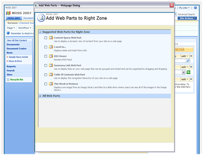
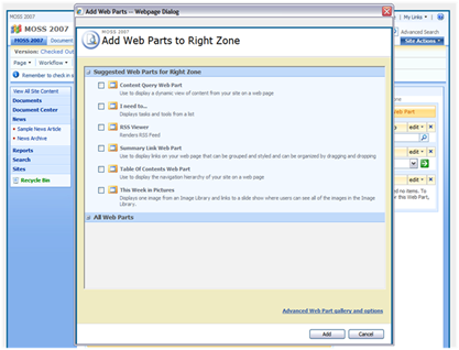
The reason why I needed to add the #mainTable class with a width of 100% is that there is a issue with the Web part picker that when you click on Add a Web Part it uses the class of ms-main and since that class now has a fixed width it does not display properly. See screenshot below: Notice you cannot see the "advanced web part gallery and options link or the ADD, and Cancel Buttons... To see them you have to expand the window. (Not a good experience for your users)
So by using the #mainTable class properties above to set the width to 100% you get the correct display of the Web Part Picker.
 I guess the way the webpart picker works is that there is a masterpage that lives in the "C:\Program Files\Common Files\Microsoft Shared\web server extensions\12\TEMPLATE\LAYOUTS" directory called "pickerdialog.master" and in this master page there is the following html:
<TABLE class="ms-main" CELLPADDING=0 CELLSPACING=0 BORDER=0 WIDTH="100%" HEIGHT="100%" id="mainTable">
I have simply taken the ID of that table to fix the issue with webpart picker. The reason why this works is that on the default masterpage this ID is not present.
If you dive deeper into the file there is a content place holder called: <asp:ContentPlaceHolder id="PlaceHolderDialogBodySection" runat="server"/>
The file that defines this Content Control is located in the same directory called "webpartgallerypickerpage.aspx". This page has the classes that define the look and feel of the Webpart selection but not the outside container of the picker. The outside shell is controlled by the Master page listed above.
Sorry about the rant on the Picker but it is very important to know about how classes are shared across many different types of pages. That is why it is always a really good idea to make sure you dedicate enough time for testing!
In your alternate stylesheet add the following classes and properties:
body{
background-color:#EEE;
font-family:verdana,arial,helvetica,sans-serif;
color:#000;
text-align: center;
padding-top: 20px;
}
.ms-main{
width: 980px;
border: 3px #006699 solid;
border-bottom: 0px #0066699 solid;
background-color:#FFF;
}
#mainTable{
width: 100%;
}
Here is an example of what the results of the code above would look like:

Simplified HTML from OOTB SharePoint
<HTML>
<HEAD>
</HEAD>
<BODY>
<form>
<TABLE class="ms-main">
</TABLE>
</form>
</BODY>
</HTML>
Basically if you look at the the simplified SharePoint's html and Classes above you will notice we are simply applying a light background color, Top Padding, and Text-Aligning property to the <Body> tag. This helps center the site, and brand it as a container.
As for the "ms-main" class we are setting the width of the site to be 980px (you can set this to what ever you like but If majority of your users are all 1024x768 or above I would recommend using this size.) I have also added in a border to help contain the site and a background color of white, so when classes that do not have a background color specified do not show the gray <body> background.
The reason why I needed to add the #mainTable class with a width of 100% is that there is a issue with the Web part picker that when you click on Add a Web Part it uses the class of ms-main and since that class now has a fixed width it does not display properly. See screenshot below: Notice you cannot see the "advanced web part gallery and options link or the ADD, and Cancel Buttons... To see them you have to expand the window. (Not a good experience for your users)

So by using the #mainTable class properties above to set the width to 100% you get the correct display of the Web Part Picker.
 I guess the way the webpart picker works is that there is a masterpage that lives in the "C:\Program Files\Common Files\Microsoft Shared\web server extensions\12\TEMPLATE\LAYOUTS" directory called "pickerdialog.master" and in this master page there is the following html:
<TABLE class="ms-main" CELLPADDING=0 CELLSPACING=0 BORDER=0 WIDTH="100%" HEIGHT="100%" id="mainTable">
I have simply taken the ID of that table to fix the issue with webpart picker. The reason why this works is that on the default masterpage this ID is not present.
If you dive deeper into the file there is a content place holder called: <asp:ContentPlaceHolder id="PlaceHolderDialogBodySection" runat="server"/>
The file that defines this Content Control is located in the same directory called "webpartgallerypickerpage.aspx". This page has the classes that define the look and feel of the Webpart selection but not the outside container of the picker. The outside shell is controlled by the Master page listed above.
Sorry about the rant on the Picker but it is very important to know about how classes are shared across many different types of pages. That is why it is always a really good idea to make sure you dedicate enough time for testing!
Wednesday, October 22, 2008
Example: SharePoint Branding Install Instructions
After all branding files have been created we as designers sometimes don't get the option to install and implement the visual design ourselves. So the creation of an Install Guide can be important in two ways.
- Ability for the site owner/Administrator to have a back up guide on how to re-apply the visual design in case of a Disaster Recovery.
- If someone other than the creator of the branding files needs to apply the branding due to security reasons/Location.
- Publishing Site
- Custom Master Page
- Custom Page Layout
- Custom CSS
- Custom Images
- Enable the Office SharePoint Server Publishing Infrastructure Feature for the top level site collection.
- Click on Site Actions > Modify All Site Settings
- Click on Site collection features
- Make sure the "Office SharePoint Server Publishing Infrastructure" is Active
- Enable the Office SharePoint Server Publishing for the site.
- Click on Site Actions > Modify All Site Settings
- Click on Site features
- Make sure the "SharePoint Server Publishing" is Active
- Go to the following directory on the server (if there are more than 1 web server make sure this is done on each)
- C:\Program Files\Common Files\Microsoft Shared\web server extensions\12\TEMPLATE\IMAGES
- Copy over the “XYZ_Images” folder.
- Go to the following directory on the server (if there are more than 1 web server make sure this is done on each)
- C:\Program Files\Common Files\Microsoft Shared\web server extensions\12\TEMPLATE\LAYOUTS\1033\STYLES
- Copy over the “XYZ_Styles” folder.
- From the top level site collection do the following:
- Click on Site Actions > Modify All Site Settings
- Click on “Master pages and page layouts”
- Upload both the “XYZ_Custom.master” and “XYZ_PageLayout.aspx” files. Make sure these files are Checked in as a major version, and Accepted if approval is required.
- Change the XYZ_Custom.master file properties to the following:
- Content Type: Publishing Master Page
- Change the XYZ_PageLayout.aspx file properties to the following:
- Content Type: Page Layout
- Content Type Group: Page Layout Content Type
- Content Type Name: Welcome Page
- From the top level site collection do the following:
- Click on Site Actions > Modify All Site Settings
- Click on “Master page”
- Choose the “XYZ_Custom.master” for both the Site Master Page, and the System Master Page.
- Check off the boxs to reset all sub sites.
- At the bottom of the page click on Specify a CSS to be used… and paste in the following path:
- /_layouts/1033/styles/xyz_styles/xyzstyle.css
- Check off the box to reset all sub sites.
- From the top level site collection do the following:
- Click on Site Actions > Edit Page
- In the Toolbar click on the “Page” button then “Page Settings”
- Under Page Layout section choose “xyz_PageLayout.aspx” from the drop down
Tuesday, October 21, 2008
Knowing the basics of CSS (Cascading Style Sheets)
If you want to know more about CSS and how to use it, there are many great resources out there that can help you get started: I would start with http://www.w3schools.com/Css/default.asp
Here are the basics that you will use:
Syntax selector {property: value;}
External Style Sheet - (Added within the <head> tags)
<link rel="stylesheet" type="text/css" href="style.css" />
Internal Style - (Added within the <head> tags)
<style type="text/css">
selector {property: value;}
</style>
Inline Style- (Added within the <body> tags)
<tag style="property: value">
Or use the following table with some of the most basic Properties. I am using the .MS-Main class as a reference for all of the examples below.
<td class="ms-main"></td>
Notice the class does not have the "." period in front of it. To add style to this class you would use the following syntax:
.ms-main {color: red;}
A ID is referenced in the HTML as the following:
<DIV ID="ms-main"></DIV>
To add style to this class you would use the following syntax:
#ms-main {color: red;}
So if you can remember that Classes use (.) periods and ID's Use (#) Pound signs you should be golden.
Here are the basics that you will use:
Syntax selector {property: value;}
External Style Sheet - (Added within the <head> tags)
<link rel="stylesheet" type="text/css" href="style.css" />
Internal Style - (Added within the <head> tags)
<style type="text/css">
selector {property: value;}
</style>
Inline Style- (Added within the <body> tags)
<tag style="property: value">
Or use the following table with some of the most basic Properties. I am using the .MS-Main class as a reference for all of the examples below.
Properties | Example | Other Values |
Backgrounds | ||
background-color | .MS_Main{ background-color: #000000 } | black rgb(0,0,0) transparent |
background-image | .MS_Main{ background-image: url(imgname.gif); } | none |
background-position | .MS_Main{ background-position: top left; } | top center top right bottom right x% y% xpos ypos (Many Others) |
background-repeat | .MS_Main{ background-repeat: no-repeat; } | repeat repeat-X repeat-Y |
background-attachment | .MS_Main{ background-attachment: fixed; } | scroll |
Borders | ||
border | .MS_Main{ border: 1px #000000 solid; } | none |
Element Position and Visibility | ||
display Note: You will never use display none for the body of you website. | .MS_Main{ display: none; } | Block (Many others) |
visibility | .MS_Main{ visibility: hidden; } | visible collapse |
position | .MS_Main{ position: relative; top: 10px; left: 10px; } | static absolute fixed |
Heights and Widths | ||
height | .MS_Main{ height: 400px; } | auto length (px) % |
width | .MS_Main{ width: 980px; } | auto length (px) % |
Fonts and text treatments | ||
Font-family | .MS_Main{ Font-family: arial, sans-serif; } | Times, Serif (many Others) |
Font-size | .MS_Main{ Font-size: 12pt; } | 10px 1.1em x-large |
Font-style | .MS_Main{ Font-style: italic; } | normal oblique |
Font-weight | .MS_Main{ Font-style: bold; } | normal bolder lighter 100 (Many Others) |
Text-align | .MS_Main{ Text-align: center; } | left right justify |
Text-decoration | .MS_Main{ Text-decoration: underline; } | none overline line-through blink |
Line-height | .MS_Main{ Line-height: 20px; } | normal number length (px) % |
Spacing of Elements | ||
Padding | .MS_Main{ Padding: 20px; } | padding-top padding-left (Many Others) |
Margin | .MS_Main{ margin: 10px; } | margin-top margin-left (Many Others) |
Pseudo-classes | ||
Hover Note: you apply this pseudo class after the class name to achieve a hover state effect. | .MS_Main:hover { Background-color: #CC0000; } | |
Transparencies Note: You can make a class’s opacity to give it a transparent look. | .MS_Main: { filter:alpha(opacity=50); -moz-opacity:0.5; -khtml-opacity: 0.5; opacity: 0.5; } | |
!Important tag Note: Sometimes your css will not override hardcoded inline styles or ids so you can simply force the style with the !important tag. | .MS_Main{ Background-color: #CC0000 !important; } |
Differences between Classes and ID's
A class is referenced in the HTML as the following: <td class="ms-main"></td>
Notice the class does not have the "." period in front of it. To add style to this class you would use the following syntax:
.ms-main {color: red;}
A ID is referenced in the HTML as the following:
<DIV ID="ms-main"></DIV>
To add style to this class you would use the following syntax:
#ms-main {color: red;}
So if you can remember that Classes use (.) periods and ID's Use (#) Pound signs you should be golden.
Comments
Post a Comment