OOTB SharePoint Layered Photoshop File
I have created a Photoshop layered file, based on the OOTB SharePoint look and feel. This file includes the following:
You can download this file here: Download
Enjoy!
Write me a comment if you find this useful!
- Nested Folders
- Labeled Layers
- Editable Text
- Exact Font Colors and Type
- Separation of background elements
- Resolution set to 1024x768

You can download this file here: Download
Enjoy!
Write me a comment if you find this useful!
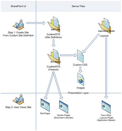
I will walk you though a few steps to implement your branding by using custom Site Definitions, Master Pages, and Features.
Images:
Place all modified images in a new folder in the following directory
Create a separate CSS file and place it in a new folder in the following directory.
Go to the following directory on the server (if there are more than 1 web server make sure this is done on each)
Go to the following directory on the server (if there are more than 1 web server make sure this is done on each)
I will refer to this post for creating this part of the process:
http://techietweaks.blogspot.com/2008/08/creating-custom-sharepoint-masterpage.html
Install Feature:
Open up a command prompt
Open up a command prompt and type “IISRESET”
**** Make sure the permissions that are set to that new folder are the same as the original or basic users will get prompted for authentication because they don’t have permission for the images/styles ****
Delete all temporary internet files from your browser and then refresh the page
Here is a diagram that explains how this all works:
Images:
Place all modified images in a new folder in the following directory
- C:\Program Files\Common Files\Microsoft Shared\web server extensions\12\TEMPLATE\IMAGES\Custom
Create a separate CSS file and place it in a new folder in the following directory.
- C:\Program Files\Common Files\Microsoft Shared\web server extensions\12\TEMPLATE\LAYOUTS\1033\STYLES\Custom
Go to the following directory on the server (if there are more than 1 web server make sure this is done on each)
- C:\Program Files\Common Files\Microsoft Shared\web server extensions\12\TEMPLATE\LAYOUTS
- Add a <link type="text/css" rel="stylesheet" href="" /> in the head of the Application.Master to your alternate stylesheet.
Go to the following directory on the server (if there are more than 1 web server make sure this is done on each)
- C:\Program Files\Common Files\Microsoft Shared\web server extensions\12\TEMPLATE\SiteTemplates
- Make a copy of the “STS” folder and re-name it to something like "CUSTOMSTS".
- Go to C:\Program Files\Common Files\Microsoft Shared\web server extensions\12\TEMPLATE\1033\XML
- Copy the “WEBTEMP.XML” File, Re-Name it.
(Ex: WEBTEMPCUSTOM) and change all references from STS to CUSTOMSTS. This post does not effect any of the MPS or Meeting workspace sites. So delete all Templates that refer to MPS.
I will refer to this post for creating this part of the process:
http://techietweaks.blogspot.com/2008/08/creating-custom-sharepoint-masterpage.html
Install Feature:
Open up a command prompt
- Type the following:
- “C:\Program Files\Common Files\Microsoft Shared\web server extensions\12\BIN\stsadm.exe” –o installfeature –filename CUSTOMSTSMasterPage\feature.xml
Open up a command prompt and type “IISRESET”
**** Make sure the permissions that are set to that new folder are the same as the original or basic users will get prompted for authentication because they don’t have permission for the images/styles ****
Delete all temporary internet files from your browser and then refresh the page
Here is a diagram that explains how this all works:

As part of our normal delivery on branding projects we usually supply a SharePoint style guide. This document is intended to be used by site owners/developers to support the branding once the project is complete. I have created many variations of this type of document, What I find really helpful for the consumers of this document is to provide some of the following:
Branding Requirements: Example
| # | Properties |
| 1 | Branding will be applied at the site collection level |
| 2 | Any Changes to branding (CSS, Images) will automatically get updated to the site. Admin will not have to force or re-apply styles |
| 3 | When a sub-site is created, it will automatically have branding applied. |
| 4 | All _layout application pages will have branding as well. |
Write in the implementation method related to those Requirements and how they will be met: Example
| Requirement # Met | Approach | Known Issues |
| 2, 3, 4 | Modify Core Server CSS File: Including Custom CSS at the end of the Core.css file on each one of the web front end servers | This will be applied to all sites, sub-sites, application pages, and My Sites. However if another application needs to have their own branding it will have to override the custom CSS. All default files will need to be backed up in case of service pack updates or upgrades. *For the first release this would be recommended as the best method. |
| 2, 3, 4 | Modify All Core Server Master Pages: Adding a CSS Reference to all major master page files on the server. Application.master, default.master, simple.master | Same as modify core CSS file. (This approach is not a best practice) |
| 2, 3 | Modify Server Default.Master: Adding a CSS Reference to the server side default.master | This will not modify the system pages located in the _layouts pages. |
| 1, 2, 3, 4* | Custom Site Definitions and Ref. Alternate Style sheet: Create Custom Site Definitions, reference Custom CSS file in all Default.aspx pages, and Reference an alternate CSS file at the top level site collection. | This method meets all of the required elements but the following is a known issue *The Alternate Style sheet will have to be applied to every top level site collection and not all system pages will be branded… |
| 1, 2, 3 | Custom Site Definitions Create Custom Site Definitions, reference Custom CSS file in all Default.aspx pages. | This method will not brand system pages. |
| 1, 2, 4 | Custom Master Page within UI and Ref. Alternate Style sheet: Create custom Master page and store it in the Master Page and Page Layouts Gallery with reference to Custom CSS file on the server. At the top level the alternate Style sheet will need to be referenced within the UI. | This approach is the most flexible and is the best practice for brand implementations per site collection. However the custom master page will have to be uploaded and applied for every site collection. When new WSS sites are created the brand will not be applied automatically |
| 1, 2 | Custom Master Page within UI Create custom Master page and store it in the Master Page and Page Layouts Gallery with reference to Custom CSS file on the server. | This approach will not touch any system pages. |
| 4 | Custom Theme Create a custom theme and apply it to each site. | This approach is defined per site and cannot be pushed across all sites. If design is modified it will not be visible until an IISREST and the theme is removed and then applied again. |
| 1, 2, 4 | Alternate Style Sheet Reference the Alternate Style sheet at the top level site collection. | This approach does not get applied when a new site is created. |
I will use my personal favorite design that I have created as an example: Pimp My Portal...

Zone 1:
| Preview | Main Classes |
 | .ms-globalbreadcrumb |
 | .ms-globallinks, .ms-globallinks a |
| Preview | Main Classes |
 | .ms-globalTitleArea |
 | td.ms-titleimagearea #GlobalTitleAreaImage |
 | #SRSB |
/* Zone 1: Top Navigation Styles */
.ms-globalbreadcrumb{
background-image:none !important;
background-color:transparent !important;
border-bottom: 0px #2d5696 solid;
padding:3px 10px 0px 10px;
}
/* Zone 2: Global Title Area */ .ms-globalTitleArea{
text-align:right;
background-image:none;
background-position:right top;
background-repeat:no-repeat;
background-color: transparent;
height: 63px;
padding-left:10px;
padding-right:0px;
padding-top:1px;
}
/* Zone 2: Search box Positioning */
#SRSB{
padding-top: 15px;
}
Some of the other parts of the SharePoint Branding Style Guide would include:
- Approved Logos
- Approved Corporate Color Palette
- Image and CSS Locations
- Installations Instructions
- List of Modified Images
Simply said, "Just because you can, doesn't mean you should".
I have noticed that I am saying this phrase to myself more often than not with SharePoint. When it comes to SharePoint Branding you/client/developers have allot of choices to make. Its never as easy as you think.
I find myself going down the rat hole of making it overly complicated not because I don't know what I am doing, but because I know I have the power to do so.
Within SharePoint master pages you have the ability to change the default class names. For example if I wanted to change the class name within a custom master page for the quick launch
(ms-quicklaunch) to your own custom class (xyz-quicklaunch) its very easy to do in the master page. However you might be getting yourself into allot of headaches because with out really thinking about it you might have totally screwed yourself... Since you now have stripped that main class out of the page all of the default references to ms-quicklaunch will have to be added to your custom style sheet even though you might not be changing 1 single attribute for that class...
Classes that have a parent child relationship depend on some of those default classes. In the default core.css file you might have the following Example:
ms-quicklaunch .ms-navitem{
padding: 10px;
}
So in the example above this class is saying that all ms-quicklaunch classes that have ms-navitem in it will get padding of 10 pixels. if you do not reference all of those one off classes, you might find your design getting a little bit funky. This is especially true with font sizes, margins, and padding.
Therefore here is my conclusion:
If you are going to be creating a brand from scratch and removing all references to the OOTB style sheets, go ahead and rename those classes. But if you are going to keep the OOTB style sheet reference save your self the headache and keep the class names but put all of your override styles in a alternate style sheet.
Branding SharePoint Drop Downs
SharePoint has quite a few different drop down menus, within this post I will highlight the three primary drop downs and the CSS that drives it.
#1 Main Navigation Drop down:
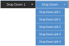
The Main Navigation drop downs are a new addition to SharePoint from its previous SPS 2003 version. Here are the following classes that make up this navigation:
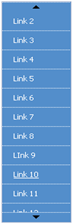 The SharePoint team also put into place a little hidden gem of logic that states that when a list is longer than the height of the page, it will create a scroll type drop down.
If you move your mouse to the top arrow it will scroll up, and if you move your mouse to the bottom as expected it will scroll down.
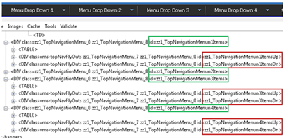
If you look at the image below the screen capture has 4 main navigation items all with drop down items. The ID's highlighted in green specify the Top Navigation Menu Item # 1, 2, 3, 4. For each navigation menu item if a drop down is available SharePoint will add in two div tags. The first one is the Menu Items Up which has an Image drawn from the /WebResource.axd file. The second DIV tag right below it is the Menu Items Down which also has an Image drawn from the /WebResource.axd file.
If you really needed to customize this you could simply add the following classes to your alternate stylesheet. But you would have to make sure you create as many Menun #s per how many top navigation items you have on your site.
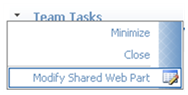
#2 Site Actions Drop Down:
The Site actions drop down is a bit more complex. It uses quite a bit more styles than the main navigation. Here are some things to consider when branding this menu:
#3a Document Drop Down
#3b Modify Webpart Drop Down
Both of the examples above use the same menu classes. You will notice that the space dedicated to the icons is allot smaller. All the classes for the large drop down are shared but for this menu it uses the following class to specify its smaller background image.
One last thing to consider is if you are deploying language packs that change the orientation of text to read right to left. The navigation will also be change.
Here are the classes that make up the right to left menus:
Drop me a comment if you have any questions/comments
#1 Main Navigation Drop down:

The Main Navigation drop downs are a new addition to SharePoint from its previous SPS 2003 version. Here are the following classes that make up this navigation:
Class Name | Details |
| .ms-topNavFlyOutsContainer { border:solid 1px #c2dcff; } | This is the outer container. Modify this for the outer border. |
| .ms-topNavFlyOuts{ background-color:#F2F8FF; font-family:Tahoma; font-size:8pt; } | This is the inner container. Modify this for the drop down background and basic fonts. |
| .ms-topNavFlyOuts a{ display:block; *width:120px; min-width:120px; color:#3764a0; padding:4px 8px 4px 8px; } | This class specifies the drop down items, width, color, and padding. You might want to put in a width: 100% !important; tag in case you have an instance where you have a small drop down item and an item that its characters exceed 120px. |
| .ms-topNavFlyOutsHover{ background-color:#ffe6a0; color:#000000; } | This class specifies the hover state of each drop down item. You will also want to put in width: 100%; into this class as well so that you don't get a default color background that you don't want. |
 The SharePoint team also put into place a little hidden gem of logic that states that when a list is longer than the height of the page, it will create a scroll type drop down.
 If you move your mouse to the top arrow it will scroll up, and if you move your mouse to the bottom as expected it will scroll down.
If you look at the image below the screen capture has 4 main navigation items all with drop down items. The ID's highlighted in green specify the Top Navigation Menu Item # 1, 2, 3, 4. For each navigation menu item if a drop down is available SharePoint will add in two div tags. The first one is the Menu Items Up which has an Image drawn from the /WebResource.axd file. The second DIV tag right below it is the Menu Items Down which also has an Image drawn from the /WebResource.axd file.

If you really needed to customize this you could simply add the following classes to your alternate stylesheet. But you would have to make sure you create as many Menun #s per how many top navigation items you have on your site.
Class Name | Details |
| #zz1_TopNavigationMenun1ItemsUp{ background-color: #FFF; } #zz1_TopNavigationMenun1ItemsDn{ background-color: #FFF; } | This class is for the top and bottom boxes only for the 1st navigation item with a drop down. |
| #zz1_TopNavigationMenun2ItemsUp{ background-color: #FFF; } #zz1_TopNavigationMenun2ItemsDn{ background-color: #FFF; } | Same as above but for Menun #2 |

The Site actions drop down is a bit more complex. It uses quite a bit more styles than the main navigation. Here are some things to consider when branding this menu:
- Define the color of the text, both Heading and description
- Define what kind of image treatment you want behind the icons.
- Define the hover state as a user moves the mouse over each item. (Background color, and Border line)
Class Name | Details |
| .ms-MenuUIPopupBody TABLE { color:#003399; font-size:100%; margin:0px; padding:0px; } | This class specifies the Basic menu color for the Bold Menu Label. However it could be over written see below. |
| .ms-MenuUISeparator,.ms-MenuUISeparatorRtL,.ms-MenuUISeparatorLarge,.ms-MenuUISeparatorLargeRtl { background-color:#c5c5c5; font-size:1px; height:1px; line-height:1px; } | This class specifies the color of the separator line. |
| .ms-MenuUI,.ms-MenuUILarge,.ms-MenuUIRtL,.ms-MenuUILargeRtL { background-color:#fafafa; background-repeat:repeat-y; cursor:pointer; } | These classes represent the overall background color. |
| .ms-MenuUILarge { background-image:url("/_layouts/images/MGradLarge.gif"); width:250px; } | This class is specific to all large size drop down menus. Including the Welcome, and My Links drop down. |
| .ms-MenuUILabel{ padding: 2px 0px 3px 6px; } | This class specifies the bold menu labels padding. Since the color is not specified here but driven by the Pop up table. You could overide the color by adding it in here. |
| .ms-menuitemdescription { color:#666666; } | This class specifies the color of the description text for each menu item. |
| .ms-MenuUIItemTableHover { background-color:#ffe6a0; border:1px solid #d2b47a; } | This class specifies the hover state when a user moves their mouse over each item. |

#3b Modify Webpart Drop Down

Both of the examples above use the same menu classes. You will notice that the space dedicated to the icons is allot smaller. All the classes for the large drop down are shared but for this menu it uses the following class to specify its smaller background image.
Class Name | Details |
| .ms-MenuUI { background-image:url("/_layouts/images/MGrad.gif"); } | This menu specifies the smaller graphic. |

Here are the classes that make up the right to left menus:
Class Name | Details |
| .ms-MenuUIRtL { background-image:url("/_layouts/images/MGradRtl.gif"); } | Background image for small right to left menus |
| .ms-MenuUILargeRtL { background-image:url("/_layouts/images/MGradLargeRtl.gif"); width:250px; } | Background image for large right to left menus |
"CSS" stands for: "Cascading Style Sheets'.
This means that the styles cascade and are applied in order as they are read by the browser. The browser reads CSS from top down. The first style is applied and then the second and so on. So if a style appears at the top of a style sheet and then is changed lower down in the document, the last one wins!
For example, in the following style sheet, the div class "text" will be white, even though the first style property applied is black:
So, to make the div class text always black, simply add the
"!important" tag right before the closing semicolon.
Example 1: You have applied a custom theme to a site. But on some of your pages the colors are inconsistent. Use the !important tag to force the class attributes so that all color behaviors act as expected.
Example 2: You are in the middle of creating your custom brand and notice that around the content area there is some hard coded margins. You could either create your own custom master page to fix this or you could force the margins the way you want them by using the !important tag.
I do not suggest using the !important tag for everything. Its a bit of a cop out. But there are some cases where it really does help keep your design functioning as your want it.
This means that the styles cascade and are applied in order as they are read by the browser. The browser reads CSS from top down. The first style is applied and then the second and so on. So if a style appears at the top of a style sheet and then is changed lower down in the document, the last one wins!
For example, in the following style sheet, the div class "text" will be white, even though the first style property applied is black:
#text{ color: #000000;}The !important rule is a way to force styles out of order. A rule that has the !important property will always be applied no matter where that rule appears in the CSS document. So if you wanted to make sure that a property always applied, simply add the !important property to the tag.
#text{ color: #FFFFFF;}
So, to make the div class text always black, simply add the
"!important" tag right before the closing semicolon.
#text{ color: #000000 !important;}
#text{ color: #FFFFFF;}To relate this back to SharePoint here are few examples where you might need to use the !important tag to get your styles listen.
Example 1: You have applied a custom theme to a site. But on some of your pages the colors are inconsistent. Use the !important tag to force the class attributes so that all color behaviors act as expected.
Example 2: You are in the middle of creating your custom brand and notice that around the content area there is some hard coded margins. You could either create your own custom master page to fix this or you could force the margins the way you want them by using the !important tag.
I do not suggest using the !important tag for everything. Its a bit of a cop out. But there are some cases where it really does help keep your design functioning as your want it.
This post was originally created in a 26 page PPT deck that I created. Here are the highlights of that presentation.
Anything is Possible: With the ability to create custom Master Pages/layouts, the amount of customizations are endless...
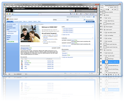
Examples of Highly Customized MOSS sites:
Please keep the following in mind
Not all projects are the same.
Brand Adaptation for MOSS 2007 ~ 1-2 Weeks
Gather Requirements: See my blog post - It’s like pulling teeth…
Have Client/Marketing fill out Branding/IA questionnaire before Kickoff.
Cascading Style Sheet (CSS) Build
Server Site Information
I hope this comes in handy for anyone who reads it.
Drop me a comment!
Anything is Possible: With the ability to create custom Master Pages/layouts, the amount of customizations are endless...
Examples of Highly Customized MOSS sites:
Please keep the following in mind
Not all projects are the same.
- Some require more 1 on 1 attention
- Some defer all branding look and feel requirements to either their own internal marketing departments or external vendors for definitions.
- Some allow full creative freedom, while others are pre-defined.
- The process described in this post is intended for internal small scale sites. And not intended as a basis for all implementations!
- User Interface Design is the process of creating a consistent, successful, integrated design solution. This solution follows the information architecture and technical underpinnings of the site, and provides an expression of those elements through consistent look and feel. The UI designer melds typography, screen layout, color palettes, iconography, site photography and all other user-facing elements into a finished expression of visual style.
Brand Adaptation for MOSS 2007 ~ 1-2 Weeks
- 1-2 Days for requirements
- 2-3 Days for design (1-2 design Mock ups, 1 cycle for revisions)
- 2-4 Days for building of CSS, Images, and if needed Master Pages.
- 1-2 Days for testing/bug fixes
- 1-2 Days for requirements
- 4-8 Days for design (2-3 design Mock ups, 2 cycles for revisions)
- 4-8 Days for building of CSS, Images, and if needed Master Pages.
- 2-3 Days for testing/bug fixes
- Discovery:
- Creation of the Creative Brief
- Definition:
- Creation of Visual design compositions
- Construction:
- Creation of CSS, Images, and Master Pages
- Delivery:
- Creation of Branding Style Guide
Gather Requirements: See my blog post - It’s like pulling teeth…
Have Client/Marketing fill out Branding/IA questionnaire before Kickoff.
- What type of UI customization is this?
- Brand Adaptation: Apply logo, colors only, keep out of the box layout and tab styles
- Custom brand: More design treatments, changes to lines, controls, tab styles.. stay within master page layout
- Full custom design: Change layout of master page completely.. i.e. navigation may not be in tabs, etc
- Understand the Scale
- Full portal modification: All sites, My Sites, and Administration page
- Sites only: Themes or alternate style sheets
- Page Only: Alternate style sheets, Content editor web part <style></style>)
- Master Page Modification: Custom Layout and styles
- Portal Wide, Site wide (cascading master), single page.
- What are the Brand Requirements?
- Define Colors, Fonts, Imagery, Layout, Logos, etc.
- What are the Browser Requirements?
- Liquid versus Fix width
- Visibility: Must be able to be viewed at least on 1024 X 768?
- Support IE, FireFox, Safari, Oprea, Google Chrome, Etc.
- What is in a creative brief?
- Introduction
- Existing Brand/Creative
- Vision & Approach
- Visual Components
- Brand/Identity
- Colors
- Fonts
- Structural Elements
- Shapes/Patterns/Imagery
- User Profile Information
- Iconography
- Browser Requirements/Resolution
- MOSS 2007 Accessibility Features
- Why create one?
- A creative brief gives the designer a written document to let the client know that we heard what they said and it will be a basis for which we design against.
- It is recommended that this document get signed off on before proceeding to the visual design creation.
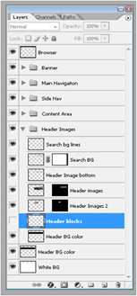
- Create The Design Composite / Mockup
- Photoshop Build: Do NOT use MS Paint!
- Take Public website, reference websites, images, colors etc.
- Adapt brand into SharePoint constraints
- Take known elements and re-use
- Draw guides
- Create Folders in the layers to keep them organized
- Name those layers, and create folders!

- Photoshop Cut and Paste
- Slice out elements and save as web ready files
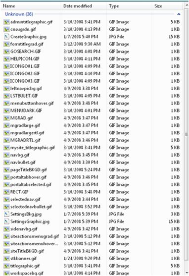
- Use existing images for support and size
- The majority of all images used within SharePoint are icons that you will rarely see/modify.
- Only a hand full of images are used to support the visual building block of the site.

Cascading Style Sheet (CSS) Build
- Layout Guide
- Layout out the widths and heights of elements on paper or within Visio for easy reference
- Document zone heights, widths, background colors, and borders (These will all go into the style guide eventually)
- Tools
- SharePoint Designer
- IE Developers Toolbar
- Where to begin?
- Main site areas
- Top Banner
- Title area / Search
- Main Navigation / Actions
- Quick Launch area
- Body area
- Webpart headers
- Fonts
- My Site
- Templates – Teamsites, Blogs, Wiki’s, Meeting Workspaces, MS Training Center
- Administrative
- Central Administration
- Main site areas
Server Site Information
- External Style Sheets
- CALENDAR.CSS
- CONTROLS.CSS
- CORE.CSS (Main)
- datepicker.css
- EwrDefault.css
- HELP.CSS
- HtmlEditorCustomStyles.css
- HtmlEditorTableFormats.css
- MENU.CSS
- OWSNOCR.CSS
- PORTAL.CSS (Supporting)
- RCA.CSS
- SiteManagerCustomStyles.css
- Image Folder Details
- Size: 2.78 MB
- Size on disk: 9.28 MB
- Contains: 2,050 Files, 0 Folders
- Folder Locations on Server
- Images
- C:\Program Files\Common Files\Microsoft Shared\web server extensions\12\TEMPLATE\IMAGES
- Styles
- C:\Program Files\Common Files\Microsoft Shared\web server extensions\12\TEMPLATE\LAYOUTS\1033\STYLES
- Images
I hope this comes in handy for anyone who reads it.
Drop me a comment!
Friday, September 19, 2008
Creating Custom WCM Styles
When creating content on a publishing site through a Page Content HTML editor there are some basic styles that come OOTB: The styles are actually conditional and different styles appear based on the type of content selected.
Text:

Pictures:

Lists:


Links:

You can view the OOTB styles by going to "http://yourportalsite/_layouts/1033/styles/HtmlEditorCustomStyles.css"
There is also the option of using the paragraph formatting dropdown to style your content.

So how do you create your own custom styles?
Text:
- Article By Line
- Article Head Line
- Article Title

Pictures:

Lists:
- Square Bullet List (Only for un-numbered lists)

- Roman Number List (Only for numbered lists)
Links:
- Link Style

You can view the OOTB styles by going to "http://yourportalsite/_layouts/1033/styles/HtmlEditorCustomStyles.css"
There is also the option of using the paragraph formatting dropdown to style your content.

So how do you create your own custom styles?
- First you will have to create your own custom CSS file.
- Then you need to know how to classify your content. Use the following attribute in your custom CSS without the quotes of course. Replace the "yourstylename" with your own custom style name without spaces.
- Images: "IMG.ms-rteCustom-yourstylename"
- Links: "A:link.ms-rteCustom-yourstylename"
- Numbered Lists: "OL.ms-rteCustom-yourstylename"
- Un-Numbered Lists: "UL.ms-rteCustom-yourstylename"
- Basic text: ".ms-rteCustom-yourstylename"
- Note: If you are creating completely new styles they will override the OOTB styles and the examples above will not show. So if you like some of the OOTB style simply copy them over to your new CSS file.
- Upload your stylesheet to either the server or a document library, and under site settings set it as an alternate style sheet. Or you could add it to the bottom the core.css file so that it is available globally across all sites.
SharePoint Branding Methods
A while back I put together a quick table of branding methods and if they were applied how deep would those changes be visible.
Here are some of the ways that you can implement your branding into Share Point: going from least visible to the most.
The first thing you should do is consider what level of branding does your client expect, or need?
Sometimes this is hard to define, and your client might not know. See my blog post Gathering Brand Requirements: It's like pulling teeth…
General Brand Levels: Refer to your SOW and make sure you are not promising anything that would be Out of Scope!
Branding Support Files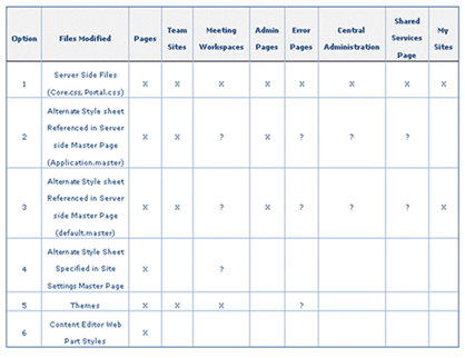
Master Page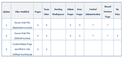
Drop a comment
Here are some of the ways that you can implement your branding into Share Point: going from least visible to the most.
- Content Editor Web Part Style
- Add a content Editor Web part on a page, then click on the source button and add:Example:
- <style>
.ms-WPHeader TD{
background-color: #EEE;
border-bottom: 2px solid #000099;
}
</style>
- <style>
- Alternate Stylesheet:
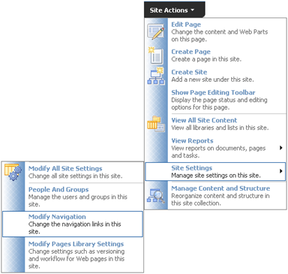
- Configure by going to: Site Settings > Modify all site settings > Look and Feel > Master Page > Alternate CSS URL > Click on radio button "Specify a CSS file to be used by this publishing site and all sites that inherit from it." > Add in URL of alternate style
- Custom Theme
- Create your own custom theme.
- Adding an Alternate style sheet to a custom master page
- Upload your custom style to the server or document library.
- Within Master page <head> add the following:
- <link rel="stylesheet" type="text/css" href="/_layouts/1033/styles/customstyle.css"/>
- Adding an Alternate style sheet to the application.master Master Page.
- Upload your custom style to the server or document library.
- Within the application.master Master page <head> add the following:
- <link rel="stylesheet" type="text/css" href="/_layouts/1033/styles/customstyle.css"/>
- Overriding the Server side CSS and Images
- Not recommended for small changes, or multiple SharePoint Applications sharing the same Web Front Ends (Intranet + Extranet + Public Website)
- Styles Location on server: C:\Program Files\Common Files\Microsoft Shared\web server extensions\12\TEMPLATE\LAYOUTS\1033\STYLES
- Main Styles (core.css, portal.css)
- Images Location on server: C:\Program Files\Common Files\Microsoft Shared\web server extensions\12\TEMPLATE\IMAGES
- Over 2,050 images. (.gif, .jpg, .png)
The first thing you should do is consider what level of branding does your client expect, or need?
Sometimes this is hard to define, and your client might not know. See my blog post Gathering Brand Requirements: It's like pulling teeth…
General Brand Levels: Refer to your SOW and make sure you are not promising anything that would be Out of Scope!
- Brand Adaptation: Apply logo, colors only, keep out of the box layout and tab styles
- Custom brand: More design treatments, changes to lines, controls, tab styles.. stay within master page layout
- Full custom design: Change layout of master page completely.. i.e. navigation may not be in tabs, etc
- Your Company
- By staying in house with the design we have better control over the design and keeping it to the approved brand level.
- We also know that the design is created with SharePoint in mind. More on this below
- Contractors
- Most design firms have no clue what SharePoint is and how to design against it.
- For that reason always make sure you share the designs in a internal peer review before showing it off to the client as our own.
- Clients
- Ok this one is a little tricky…
- Most large companies have marketing departments that own their corporate brand.
- In most cases they want to own the design and more often than not you can say goodbye to any creativity…
- Your Company
- If the consultant/developer on the project does not have any experience with SharePoint CSS branding modifications than we need to find on that does!
- Contractors
- Make sure they are well trained and skilled before allowing any customizations
- Clients
- Again make sure they have the skills.
| X = Changes will be applied ? = To be Determined Blank = Does not apply to page |

Master Page

Drop a comment
Gathering Brand Requirements: It’s like pulling teeth…
Ok, so maybe it's not that bad but in my experience clients really don't know what they want. Sometimes you get the people who just want a simple brand adaptation from an existing application, or public website. That's easy enough. Or they want to see some examples of designs that we have done for other clients. Sure no problem. Or you get clients that use the following terms when describing what they want their site to look like:
Sample Agenda for a branding JAD session: You won't get through all of this but it is a nice take away for the client to pass onto their marketing folks.
1.) Accessibility (508 Compliancy) Standards: Is this required?
2.) Browser Standards
Style guides: Ask for the most up to date version of their style guide
Colors: To be either defined by style guide or custom
Imagery: Approved imagery that can be used throughout the site (Announcements, Links, products, etc.)
4.) Functional Standards
Q1. What type of treatments do you feel are appropriate?
- Flashy
- Cool
- Clean
- Wow factor
- Easy on the eyes
- New Aged
- Techy
- Lots of white space
- Fun (Umm yea... OK...)
- Never allow anyone to put a requirement in the SRS that a portal must be fun…
Sample Agenda for a branding JAD session: You won't get through all of this but it is a nice take away for the client to pass onto their marketing folks.
1.) Accessibility (508 Compliancy) Standards: Is this required?
2.) Browser Standards
- Min Browser size: 800X600, 1024X768
- Browser Width: Full width (Liquid Design) vs. Fixed width
Site Name:
- Is there one defined?
- If so how is it represented: Text, Logo, Other?
Brand customization type
- Brand Adaptation: To what level
- Custom: Does not exists in clients environment
Brand Implementation: From top (Page) to bottom (All Site Collections)
- Site Only:
- Content Editor Web Part - Using <Style> tag
- Alternate Style sheet – Specified in sites Site Settings
- Theme – OOTB or Custom
- Site and Option to push to Sub Sites:
- Custom Master Page – In master page gallery
- Across all Site Collections
- Custom Master Page – Server Side
- Modification of Core files (Core.css, Portal.css, etc.)
Logo:
- Size
- Treatment
- Color
- Either corporate or site logo
4.) Functional Standards
- Navigation Types:
- Consistent Main Horizontal Navigation
- OOTB the main navigation does not span across multiple site collections
- Side Quick Launch (Tree view?)
- Dynamic Dropdowns: How many levels does it show? OOTB there is a max of 5
- External application links: Does it open in a new window or the same?
Q1. What type of treatments do you feel are appropriate?
- Gradations or flat colors
- Rounded corners
- Transparencies
- White Text on dark background
- Tabbed navigation
- Pixel lines for separation
- Shadows
- Simple/Complex
- Soft rounded/hard squared
- Flat/gradients
- Light/Dark
- Open/filled in
- Heavy Imagery/soft color transitions
- Heavy/light web part title bars (Chrome)
- 1 color monotone
- Multi color complimentary
- Bold accent colors
Q1. Has your company undergone any recent re-branding?
- If so will we have access to the design files?
- If not when was the last time?
Q3. Who will be approving these designs?
- Marketing (how many?)
- Board Executives (how many?)
- Project Managers (how many?)
Q5. How many design reviews do you think is needed?
- 1st Round (2 comps) 1 day for review and 1 for revisions
- 2nd Round (1 comps) 1/2 day for review and 1/2 for revisions
- Final Round (1 comps) 1 day for review and 1/2 for revisions
- Each Department or Office has their own design
- Each Site has its own color scheme
- Each Web Part has its own header style
Comments
Post a Comment